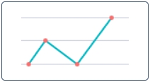
Line Reports are classified as the Time Series reports. They represent data as a line graph of points connected by segments and visualizing the metric data values. These charts are useful for comparing data per period (years, months, etc.).

Create a line report
Use Report Designer to create, configure, and style line reports.
- Navigate to the Reports → Create a Report.
- On the Data tab, fill in the mandatory fields:
- Report name - enter the desired name;
- Table - select the table you want to use as a source.
- Click Next or the Type tab to continue.
- On the Type tab, click the Line icon of the Time Series category:
- Click Next.
- Fill in the mandatory fields and configure a report, then click Refresh to generate a report.
- Customize a style of the report created, and click Refresh.
- Click Save.
To open the saved report, navigate to the Reports → All reports menu and select one from the list.
Configure a report
On the Configure tab, use settings to configure your line report.
To configure a report, follow the steps below:
- On the Configure tab, specify the report dataset.
- Click Refresh to build the report.
- Click Save to save the report.
Use the Condition Builder to establish additional conditions for data filtering and grouping.
Click the icon ![]() to open the Condition Builder, establish your conditions, then click Refresh to apply changes.
to open the Condition Builder, establish your conditions, then click Refresh to apply changes.

Fill in these fields to configure your report in a way you want.
The Configure tab fields
| Field | Description |
|---|---|
| Group by | Select a table column as a criterion for data grouping. |
| Add data table | Set this checkbox on to show the data table below your report view. |
| Trend by | Select the table column of the datetime type to use it as a timeline period. |
| Per | Select a period as a grouping criterion. |
| Combine Periods | Check this box to combine data changes over the same period with each other. |
| Aggregation type | The data aggregation allows preparing the combined datasets for data processing according to the user needs. Select a type of numeric data aggregation with one of these options:
The aggregation option selected is applied to the table column set in the Aggregation column field. |
| Aggregation column | Select a table column with numeric values for data aggregation. The Aggregation Column is only available if the Aggregation type option is not Count. |
| Groups limit | Set the limit of the data groups shown in your report with a particular number in this field. |
| Show rest as other | Set this checkbox on to show the data groups not included in Groups limit as one. The Show rest as other is only available if the Groups limit option is specified. |
Customize a style
You can configure the report look and line score colors in any way you want with the style settings.

To customize a report style, follow the steps below:
- On the Style tab of your report, configure the settings.
- Click Refresh to apply the changes.
- Click Save to save the report.
Change colors, add titles, and customize the data list and table views with the settings below.
The Style tab fields
| General Style | |
|---|---|
| Chart color type | Select the color type of your line chart from one of these options:
|
| Color | Set the color for your line chart if you selected Use one color as the color type. |
| Palette | Set the desired color palette for your line chart if you selected Use color palette as the color type. |
| Display data labels | Switch this checkbox on to display the data labels on your line chart. |
| Drilldown list layout | Use this option to configure the view of the data slice drilled down. Click the magnifier icon See Personal list layout if you want to configure the list view as you like. |
| Decimal precision | Set the number defining how much numbers should be displayed after the point of numeric data values in your chart. |
| Title Style | |
| Report title show type | Set the type for the report title showing. Select one of the options:
|
| Report title | Enter the title of the report you create. |
| Report title size | Enter the number of points to set the size of the report title. |
| Report title color | Select the color of the report title. |
| Title alignment | Set the alignment of the chart title selecting one of these options:
|
| Title bold | Switch this checkbox on to make the chart title bold. |
| Axis X Style | |
| X title | Enter the title name for the X-axis for your chart. |
| X title size | Enter the number of points to set the size for the title of the X-axis. |
| X title bold | Set this checkbox on to make the title of the X-axis bold. |
| X display opposite | Set this checkbox on to make the X-axis display opposite. |
| X display grid | Set this checkbox on to display the grid of the X-axis. |
| X grid dotted | Set this checkbox on to make the X-axis grid dotted. |
| X label size | Enter the number of points to set the size of the X label. |
| Axis Y Style | |
| Y title | Enter the title name for the Y-axis for your chart. |
| Y title size | Enter the number of points to set the size for the title of the Y-axis. |
| Y title bold | Set this checkbox on to make the title of the Y-axis bold. |
| Y display opposite | Set this checkbox on to make the Y-axis display opposite. |
| Y display grid | Set this checkbox on to display the grid of the Y-axis. |
| Y grid dotted | Set this checkbox on to make the Y-axis grid dotted. |
| Y from | Set the Y value used as the chart starting point. |
| Y to | Set the Y value used as the chart endpoint. |
| Y label size | Enter the number of points to set the size of the Y label. |