SimpleOne allows creating reports using the Report Designer and directly from the data table.
| Note |
|---|
The Report Designer can stop the report generating if the data amount is too large to display. Use the Condition Builder to limit the data sampling or try another type of report. |
Create report from list layout
description
Create from the TablesYou can create a chart out of any column, just clicking on its title. The reports generated in this way use ta report via list layout directly from the list view using a table column as the grouping criteria.
| Info |
|---|
Pie and bar Bar charts are only available for this type way of report creating. |
To create a report from a table, follow the steps below:
- Navigate to the source table you need.
- Chose a Click on the table column as , which will be a data grouping criteria and right-click on it.
- Select one of the context options:
- Pie chart - to Chart – to generate a pie report.
- Bar chart - Chart – to generate a bar chartreport.
- Export Excel - to export an excel document with datatable.

- You will see your chart in the Report Designer view.

- In the Report Designer, customize Customize your report data and style with the Report Designer tools in a way you need.in the tabs.
- Click Refresh to see the changes.

- Click Save to apply changes.

Create reports with
theReport Designer
Go- Navigate to the Reports → Create
- New menu. Data Type report options Style.
- Click Save to apply changes.
| Info |
|---|
To navigate through the Report Designer, use the Back and Next buttons or click on the tabs after filling in the mandatory fields. |
| Anchor | ||||
|---|---|---|---|---|
|
| Panel | ||
|---|---|---|
| ||
|

|

| Anchor | ||||
|---|---|---|---|---|
|
| Panel | ||
|---|---|---|
| ||
|

|

| Note |
|---|
Note that changing existing report type is not allowed. You can create new record with similar data but of another type instead. For this, please complete the steps below:
|
| Anchor | ||||
|---|---|---|---|---|
|
| Panel | ||||||||||
|---|---|---|---|---|---|---|---|---|---|---|
| ||||||||||

|


| Anchor | ||||
|---|---|---|---|---|
|
report
Stylestyle
| Panel | ||||
|---|---|---|---|---|
 |
Data Drilldown
dc

nggn

Report Types
Depending on the report Type selected, the set of configuration fields changes. To learn more, follow the links below.
Bar Reports
| Column | ||
|---|---|---|
| ||
 |
|


Report types
Create a Bar Report
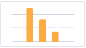
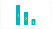
Bar Reports display categorized data in vertical bars which length is proportional to the data values. Stack or group bars to make the chart representation visual and clear.
Bar Reports display data as vertical bars with lengths proportional to data values they represent.This report view is useful for
devidingdividing data into categories and comparing them.
Create
Bar Reportsa Pie Report
Pie Reports
| Column | ||
|---|---|---|
| ||
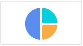 |
display data in a circular graphic divided into slices. The whole graph represents the entire report data
alongwith each slice proportionally displaying a particular data category
.Gauge Reports
| Column | ||
|---|---|---|
| ||
 |
.
This report view is useful to compare the proportions of individual values to the whole.
Create a Gauge Report
Gauge Reports represent a single metric value from the
tabledata
byvia the gauge panel with
the arrow anda dial on it.
This report view is useful for evaluating the criticality according to the established limits set.
Create
Gauge Reportsa Digit Report
Digit Reports
| Column | ||
|---|---|---|
| ||
 |
provide a simple digit representation of a single metric value.
This report view is useful for monitoring the critical parameters by clear visual presentation.
Create
Digits Reportsa Line
Reports| Column | ||
|---|---|---|
| ||
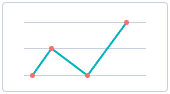 |
Report
Line Reports represent data as
linea graph of points connected by
segmentsa line and
visualizingvisualize the metric data values.
This report view is useful for comparing data per time periods (years, months, etc.).
Create
Line ReportsPivot Tables
| Column | ||
|---|---|---|
| ||
 |
a Pivot Table Report
Pivot Reports represent your data in a table view with aggregating, grouping, and analyzing using two metrics as row and column for your chart.
This report
typeview is
extremely usefuluseful for issues of
comparasingcomparing, summarizing, and counting a large amount of data.
Create a Multilevel Pivot
ReportsTable Report
Trend Reports
| Column | ||
|---|---|---|
| ||
 |
| Column |
|---|
| Trend Reports display data as columns over time. Create Trends Reports |
| Column | ||
|---|---|---|
| ||
 |
Pivot Tables Reports represent your data in a table view. The data is aggregated, grouped, and analyzed basing on two metrics (as row and column).
This report view is extremely useful for issues of comparing, summarizing, and counting a large amount of data.
Create a List Report
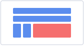
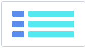
List Reports represent table data in a list view.
Create a Heatmap Report
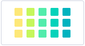
columnHeatmap Reports display your data as the intersection of two metrics in a table with colored cells. These cells contain data values visualized with color brightness.
Create
Heatmap ReportsMultilevel Pivot Reports
| Column | ||
|---|---|---|
| ||
 |
a Trend Report
Trend reports show the dynamics of data changes. The data is represented as columns over periods.
Pivot Reports represent your data in a table view with aggregating, grouping and analyzing using more than two metrics as columns and cells for your chart.This report type is
extremely useful for issues of comparasing, summarizing, and counting a large amount of data.Create Multilevel Pivot Reports
List Reports
| Column | ||
|---|---|---|
| ||
 |
useful for monitoring time parameters.
| Table of Contents | ||||
|---|---|---|---|---|
|