Versions Compared

Key

  • This line was added.
  • This line was removed.
  • Formatting was changed.

Generally, an announcement page consists of the following elements:

  1. The 

...

  1. breadcrumbs widget allows navigating within the Portal pages structure.

...

  1. The announcement page portal widget is implemented as a bundle of the existing widgets, widget attributes; also,

...

  1. server and client logic are used.

...

  1. The previewList widget is configured to display the announcement list.

These widgets interact with each other.

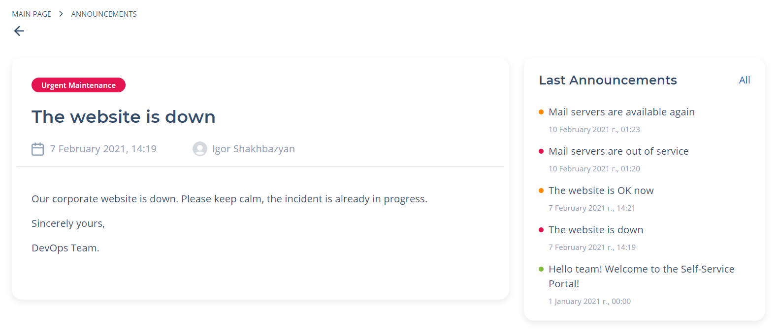
Generally, the announcement page looks as shown below:

Image Added


Info

You can modify the announcement record color scheme regarding their type. For this, create the necessary Style Rules for the Announcements table.


Breadcrumbs configuration


To configure breadcrumbs correctly, it is preferable to use the attribute values as in the example below (type these values in the Template field of the <breadcrumbs> widget form):

Code Block
languagexml
themeEclipse
titlebreadcrumbs
linenumberstrue
<div class="announcement__breadcrumbs

...

">
  <breadcrumbs>
</div>

After that, you can define the breadcrumbs view in the CSS field of this form:

Code Block
languagecss
themeEclipse
titleBreadcrumbs CSS
linenumberstrue
.customized {
   background: #FFFFFF;
  padding: 9px 0px 8px 16px;
}

Announcement widget configuration


Generally, an announcement widget looks like a card containing information that the administrator wanted to deliver to users. This card contains formatted text that can be typed with the Announcements functionality. Announcements can be bound with Task objects, such as Incidents or Change Requests. To use this widget, add it to the widget instance configured on the appropriate page by selecting the widget dictionary (select

...

the Announcement Page Portal Widget

...

 item from the list).

To modify an announcement appearance, you can clone a widget template and make changes in your copy:

  1. Navigate to the widget form and open the burger menu.
  2. Click the

...

  1. Make a copy item.
  2. Work on your copy, and use it on your portal pages

...

Preview list widget configuration

  1. .
  2. Specify the newly created and configured widget in the Widget field of the related Widget Instance record. For this, please complete the steps below:
    1. Navigate to Portal Structure → Widget Instances.
    2. Select the widget instance using an out-of-the-box widget you have cloned and modified.
    3. Click on the record to modify it.
    4. Specify your widget in the Widget field.
    5. Click Save or Save and Exit to apply changes.

Announcement list preview widget


This widget is used to display a list of already created announcements, so you can switch between them without page refreshing a page. It is recommended

...

to follow the recommendations when filling in the attribute values. You can use the example below as a pattern:

Code Block
languagexml
titleAnnouncement List
<previewList tableName="announcement" view="AnnounceView" elementCount="

...

5" subjectColumn="subject"

...


dateColumn="sys_created_at" stateColumn="state" wrap="true" itemView="announceView"

...

>
  <ListHeader>
    <div>
      Announcements
    </div>
  </ListHeader>
</previewList>