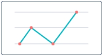
Line Reports are classified as the Time Series reports. They represent data as a line graph of points connected by segments and visualizing the metric data values. These charts are useful for comparing data per period (years, months, etc.).

Create a line report
Use Report Designer to create, configure, and style line reports.
| Panel | ||
|---|---|---|
| ||
|
Configure
a reportthe data
On the Configure tab, use settings to configure your line report.
To configure a report, follow the steps below:
- On the Configure tab, specify the report dataset.
- Click Refresh to build the report.
- Click Save to save the report.
| Info |
|---|
Use the Condition Builder to establish additional conditions for data filtering and grouping. Click the icon
|

Fill in these fields to configure your report in a way you want.
The Configure tab fields
| Field | Description | ||
|---|---|---|---|
| Group by | Select a table column as a criterion for data grouping. | ||
| Add data table | Set this checkbox on to show the data table below your report view. | ||
| Trend by | Select the table column of the datetime type to use it as a timeline period. | ||
| Per | Select a period as a grouping criterion. | ||
| Combine Periods | Check this box to combine data changes over the same period with each other. | ||
| Aggregation type | The data aggregation allows preparing the combined datasets for data processing according to the user needs. Select a type of numeric data aggregation with one of these options:
The aggregation option selected is applied to the table column set in the Aggregation column field. | ||
| Aggregation column | Select a table column with numeric values for data aggregation.
| ||
| Groups limit | Set the limit of the data groups shown in your report with a particular number in this field. | ||
| Show rest as other | Set this checkbox on to show the data groups not included in Groups limit as one.
|
Customize
athe style
You can configure the report look and line score colors in any way you want with the style settings.

To customize a report style, follow the steps below:
- On the Style tab of your report, configure the settings.
- Click Refresh to apply the changes.
- Click Save to save the report.
Change colors, add titles, and customize the data list and table views with the settings below.
The Style tab fields
| General Style | |||
|---|---|---|---|
| Chart color type | Select the color type of your line chart from one of these options:
| ||
| Color | Set the color for your line chart if you selected Use one color as the color type. | ||
| Palette | Set the desired color palette for your line chart if you selected Use color palette as the color type. | ||
| Display data labels | Switch this checkbox on to display the data labels on your line chart. | ||
| Drilldown list layout | Use this option to configure the view of the data slice drilled down. Click the magnifier icon
| ||
| Decimal precision | Set the number defining how much numbers should be displayed after the point of numeric data values in your chart. | ||
| Title Style | |||
| Report title show type | Set the type for the report title showing. Select one of the options:
| ||
| Report title | Enter the title of the report you create. | ||
| Report title size | Enter the number of points to set the size of the report title. | ||
| Report title color | Select the color of the report title. | ||
| Title alignment | Set the alignment of the chart title selecting one of these options:
| ||
| Title bold | Switch this checkbox on to make the chart title bold. | ||
| Axis X Style | |||
| X title | Enter the title name for the X-axis for your chart. | ||
| X title size | Enter the number of points to set the size for the title of the X-axis. | ||
| X title bold | Set this checkbox on to make the title of the X-axis bold. | ||
| X display opposite | Set this checkbox on to make the X-axis display opposite. | ||
| X display grid | Set this checkbox on to display the grid of the X-axis. | ||
| X grid dotted | Set this checkbox on to make the X-axis grid dotted. | ||
| X label size | Enter the number of points to set the size of the X label. | ||
| Axis Y Style | |||
| Y title | Enter the title name for the Y-axis for your chart. | ||
| Y title size | Enter the number of points to set the size for the title of the Y-axis. | ||
| Y title bold | Set this checkbox on to make the title of the Y-axis bold. | ||
| Y display opposite | Set this checkbox on to make the Y-axis display opposite. | ||
| Y display grid | Set this checkbox on to display the grid of the Y-axis. | ||
| Y grid dotted | Set this checkbox on to make the Y-axis grid dotted. | ||
| Y from | Set the Y value used as the chart starting point. | ||
| Y to | Set the Y value used as the chart endpoint. | ||
| Y label size | Enter the number of points to set the size of the Y label. | ||
| Table of Contents | ||||
|---|---|---|---|---|
|