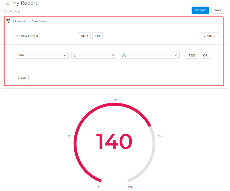
Gauge Reports represent a single metric value from the data via the gauge panel with a dial on it.
This report view is useful for evaluating the criticality according to the established limits set.

Create a gauge report
Use Report Designer to create, configure, and style gauge reports.
- Navigate to the Reports → Create New.
- On the Data tab, fill in the fields:
- Name – enter the desired name.
- Table – select the table you want to use as a source.
- Click Next or the Type tab to continue.
- On the Type tab, click the Gauge icon:

- Click Next or the Configure tab.
Configure the data, then click Refresh to generate a report.
The Report Designer can stop the report generating if there is a large amount of data to display. Use the Condition Builder to limit the data sampling or try another type of report.
- Customize the style of the report, then click Refresh.
- Click Save.
To open the saved report, navigate to Reports → All Reports and select one from the list.
Configure the data
On the Configure tab, use settings to specify the maximum and minimum scale values of your gauge report.
To configure a report, follow the steps below:
- On the Configure tab, fill in the fields.
- Click Refresh to build the report.
- Click Save to save the report.
Use the Condition Builder to establish additional conditions for data filtering and grouping.
- Click the icon
 to open the Condition Builder.
 - Set the filters.
- Click Refresh to apply changes.
The Configure tab fields
| Field | Mandatory | Description |
|---|---|---|
| Aggregation Type | N | Select the data aggregation to create combined datasets for data processing. Available options:
The Sum and Average settings make sense if the aggregation column keeps the numeric data. The aggregation option selected is applied to the table column set in the Aggregation Column field. |
| Aggregation Column | N | Select a table column with numeric values for data aggregation. The Aggregation Column is only available if the Aggregation Type option is Average, Count Distinct, Sum. |
| Maximum Value | N | Define a maximum value for the data set as the Aggregation Column. |
| Minimum Value | N | Define a minimum value for the data set as the Aggregation Column. |
Customize the style
You can configure the report look and gauge score colors with the style settings.


Configure the rules of value representation with color score limit.
To customize a report style, follow the steps below:
- On the Style tab of your report, configure the settings.
- Click Refresh to apply the changes.
- Click Save to save the report.
Change colors, add titles, and customize the data list and table views with the settings below.
The Style tab fields
| General | ||
|---|---|---|
| Field | Mandatory | Description |
| Chart Color | N | Select the color type of your pie chart from one of these options:
|
| Lower Limit | N | Enter the lower limit value for the gauge report metric. All the data values less than this limit are considered to be low scores and appropriately painted with Low Score Color. |
| Upper Limit | N | Enter the upper limit value for the gauge report metric. All the data values less than this limit are considered to be middle scores and appropriately painted with Middle Score Color. |
| Low Score Color | N | Set the value as the minimum limit of the low score value. |
| Middle Score Color | N | Set the value as the minimum limit of the middle score value. |
| High Score Color | N | Set the value as the minimum limit of the high score value. |
| Drilldown List Layout | N | Use this option to configure the view of the data slice drilled down. Click the magnifier icon See Personal list layout if you want to configure the list view as you like. |
| Decimal Precision | N | Define how many numbers should be displayed after the point of numeric data values in your chart. This field appears when the Aggregation Type field in the Configure tab contains Sum or Average. |
| Title | ||
| Field | Mandatory | Description |
| Report Title Show Type | N | Select the type for the report title showing. Available options:
|
| Report Title | N | Specify the title of the report you create. |
| Report Title Size | N | Specify the number of pixels to set the size of the report title. |
| Report Title Color | N | Select the color of the report title. Click the magnifier icon |
| Title Alignment | N | Select the alignment of the report title. Available options:
|
| Bold Title | N | Select this checkbox to make the chart title bold. |