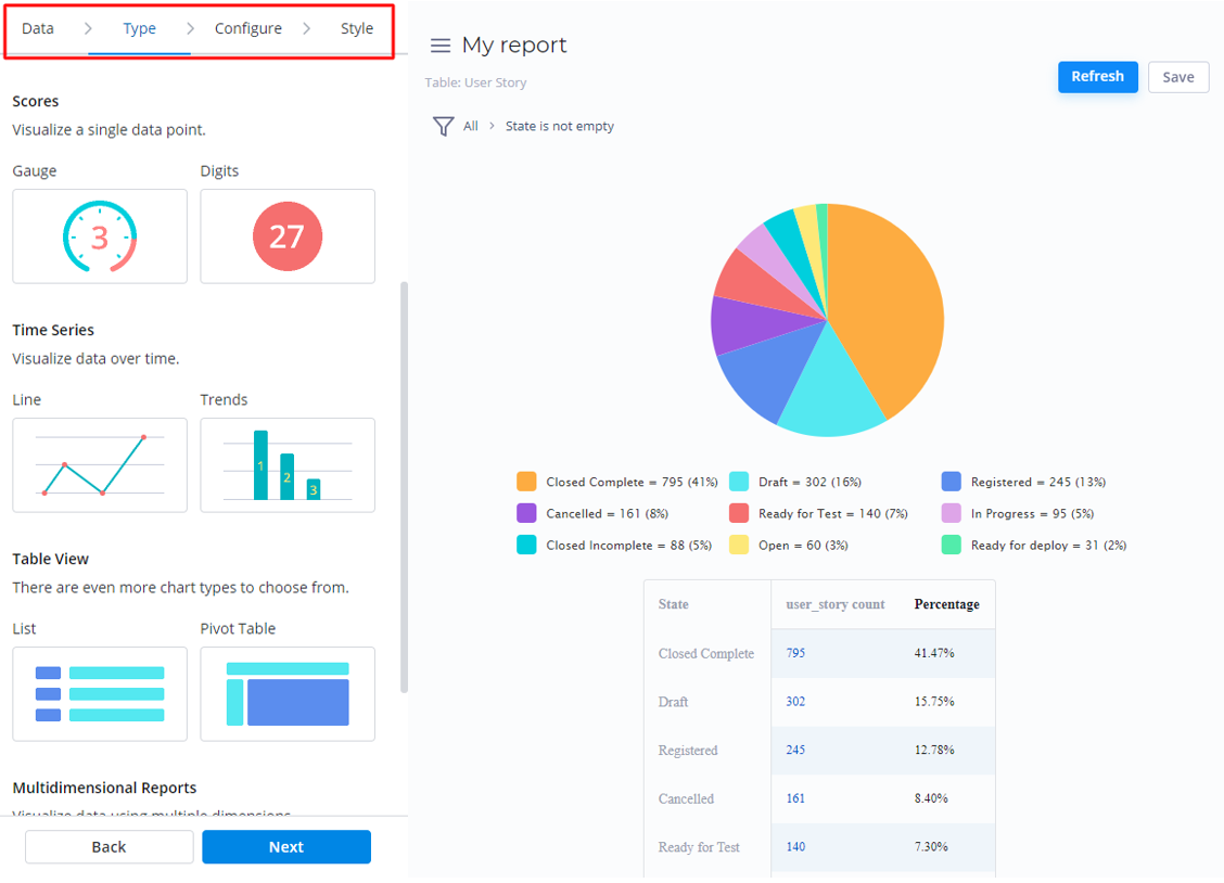
SimpleOne Report Designer is a powerful tool for data analysis, generating and configuring reports. It allows using SimpleOne tables as sources for building combined datasets and, then, visualizing it in graphical charts.
The Report Designer provides a four-step guide for report generating. Use the left-side menu to navigate through the following tabs:
- Data: this tab allows setting a data source with one of the SimpleOne data tables.
- Type: select a type of report you want to create.
- Configure: provides to establish the dataset and criteria for analyzing it.
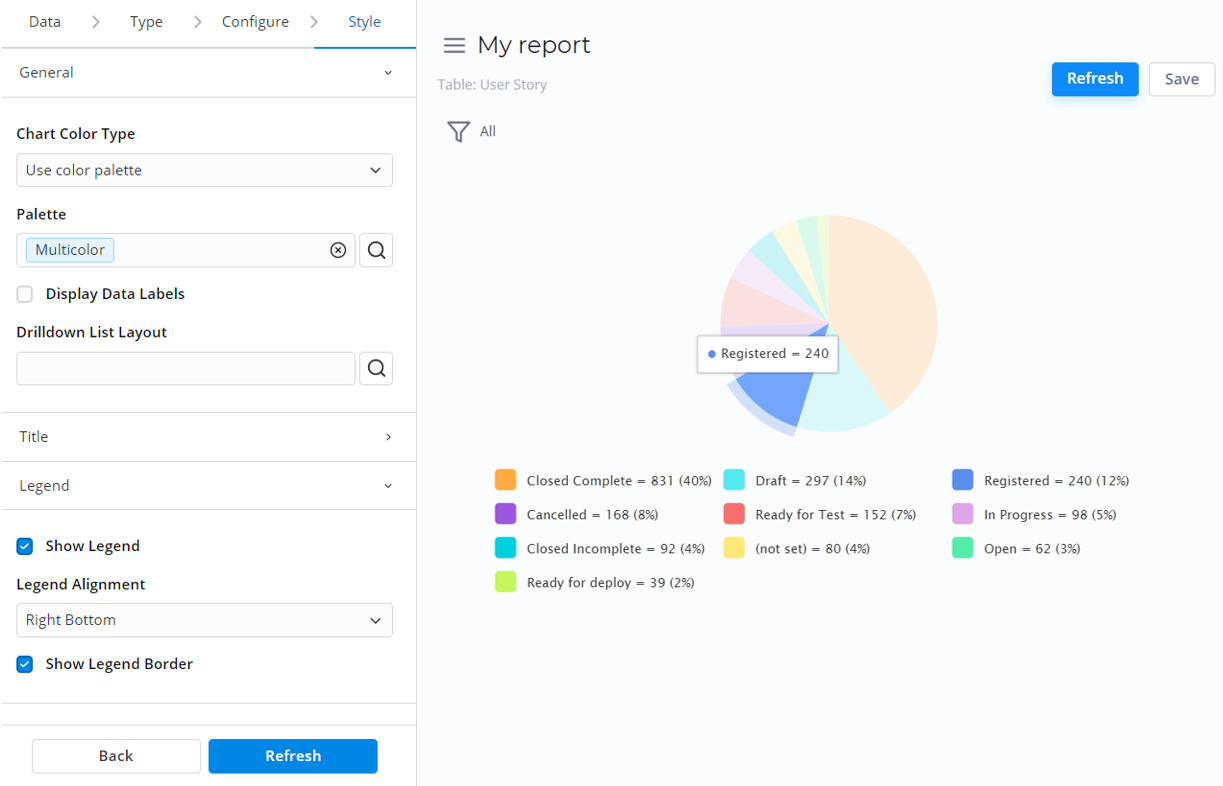
- Style: customize the report look with style settings.
| Info |
|---|
To navigate through the Report Designer, use the Back and Next buttons, or click the tabs. |
Report Designer features
View reports
The reports you save are available in the Reports list.
To view a report you created, follow the steps:
- Navigate to Reports → All Reports.
- Open the report record you need.
- Click View Report to open the report in the Report Designer.
The Report Designer can stop building a previously created report if there is a large amount of data to display. Use Condition Builder to limit the data sampling or try another type of report.
Drill down the report data
In Report Designer, graphical charts allow drilling down the report data in the list view. The generated list is sorted with the Condition Builder according to the report configuration and selected elements of the chart.
To drill down the data slice, hover and click the desired graphical element.
| Info |
|---|
See the Report Style article to learn more about configuring list layouts for the report data. |
Build your reports specifying the source data, type, configuration, and style settings.
Use the Report Designer features to print, download, or export your report to share it with others.
customizationThe SimpleOne system properties allow configuring the Report Designer data processing. Use system default settings to limit the data groups and records displayed.
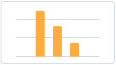
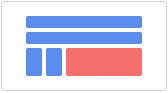
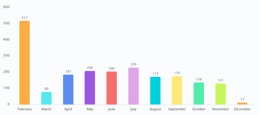
Bar Reports
| Column |
|---|
|
 |
| Column |
|---|
Bar Reports display categorized data in vertical bars which length is proportional to the data values. Stack or group bars to make the chart representation visual and clear. | Tip |
|---|
This report view is useful for dividing data into categories and comparing them. |
|
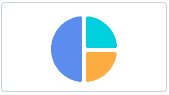
Pie Reports
| Column |
|---|
|
 |
| Column |
|---|
Pie Reports display data in a circular graphic divided into slices. The whole graph represents the entire report data with each slice proportionally displaying a particular data category. | Tip |
|---|
This report view is useful to compare the proportions of individual values to the whole. |
Create Pie Reports 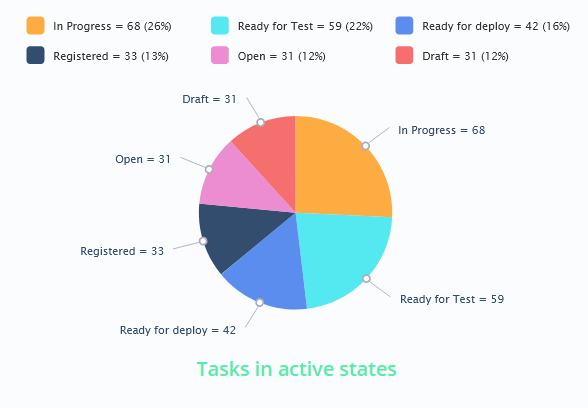
|
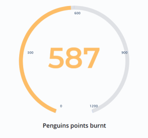
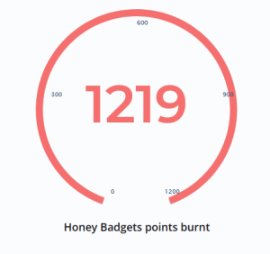
Gauge Reports
| Column |
|---|
|
 |
| Column |
|---|
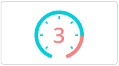
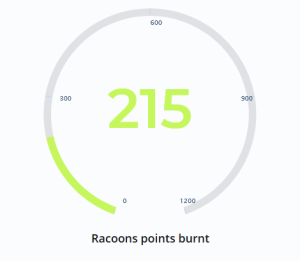
Gauge Reports represent a single metric value from the data via the gauge panel with a dial on it. | Tip |
|---|
This report view is useful for evaluating the criticality according to the established limits set. |
|
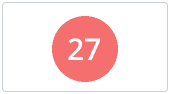
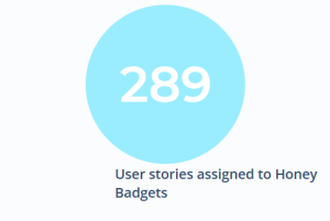
Digit Reports
| Column |
|---|
|
 |
| Column |
|---|
Digit Reports provide a digit representation of a single metric value. | Tip |
|---|
This report view is useful for monitoring the critical parameters by clear visual presentation. |
|
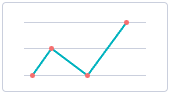
Line Reports
| Column |
|---|
|
 |
| Column |
|---|
Line Reports represent data as a graph of points connected by line and visualize the metric data values. | Tip |
|---|
This report view is useful for comparing data per time periods (years, months, etc.). |
 Image Removed Image Removed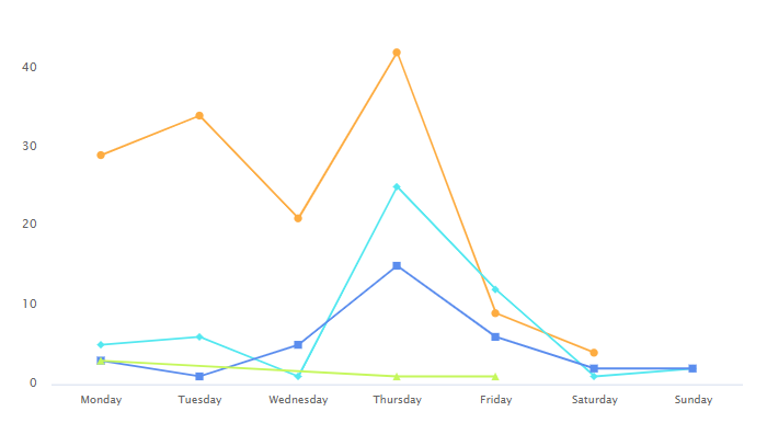 Image Added Image Added
|
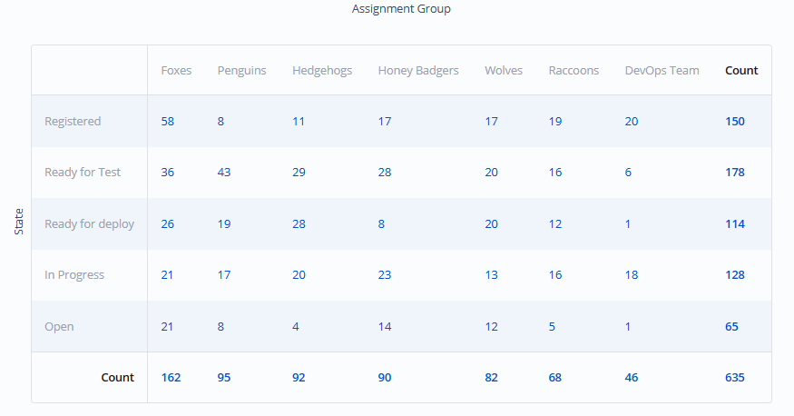
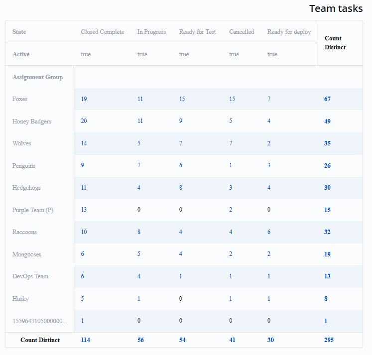
Pivot Tables
| Column |
|---|
|
 |
| Column |
|---|
Pivot Tables Reports represent your data in a table view. The data is aggregated, grouped, and analyzed basing on two metrics (as row and column). | Tip |
|---|
This report view is useful for issues of comparing, summarizing, and counting a large amount of data. |
|
Multilevel Pivot Tables Reports
| Column |
|---|
|
 |
| Column |
|---|
Pivot Tables Reports represent your data in a table view. The data is aggregated, grouped, and analyzed basing on more than two metrics (as columns and cells for your chart). | Tip |
|---|
This report view is useful for issues of comparing, summarizing, and counting a large amount of data. |
|
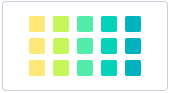
Heatmap Reports
| Column |
|---|
|
 |
| Column |
|---|
Heatmap Reports display your data as the intersection of two metrics in a table with colored cells. These cells contain data values visualized with color brightness. 
|
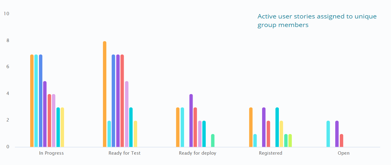
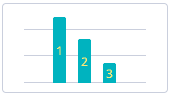
Trend Reports
| Column |
|---|
|
 |
| Column |
|---|
Trend reports show the dynamics of data changes. The data is represented as columns over periods. | Tip |
|---|
This report view is useful for monitoring time parameters. |
|
List Reports
| Column |
|---|
|

|
| Column |
|---|
List Reports represent table data in a list view.

|