When creating a widget, define its form, fields, and their behavior by behavior using the template elements to specify the widget view and the way it displays is displayed with HTML and and Widget Attributes. The widget template also allows end-users to input enter data and interact with it. Apply You can apply HTML tags to add and control elements such as buttons and various types of fields.
<authfull>
An Authorization widget component that contains full functionality of the user authorization including form of registration. It also supports configurable validation in strings containing user login and password.
The following attributes are applicable:
This attribute is responsible for the ability of the new users' registration. If it is set to "true", then new portal users can sign up; otherwise, this is prohibited, and only existing users can sign in.
Possible attribute values: "true" or "false".
Absolute path to the logo displayed on authorization page. For example:
https://example.com/logo.pngThis attribute is responsible for the ability of the user password retrieving. If it is set to "true", then the widget form will contain the retrieval link.
Possible attribute values: "true" or "false".
| Code Block | ||||||
|---|---|---|---|---|---|---|
| ||||||
<authfull redirectTo="/portal" isRegistration="true" isSwitchLang="true" isRememberMe="false" isResetPassword="true"></authfull> |
<authheader>
This portal widget allows to display a user's name and avatar, or prompts them to log in if they haven't already. The following attributes are applicable:
Specify the path to the portal section containing the personal pages when the model item is clicked.
| Info |
|---|
If specified, then the Profile item is available in the User Menu; otherwise, this item is not available, and the user is not available to watch the profile. |

| Code Block | ||||||
|---|---|---|---|---|---|---|
| ||||||
<authheader profileURL="/portal/cabinet"> |
<breadcrumbs>
A Breadcrumbs widget component that displays a navigation chain consisting of page nodes, portal categories and a an terminal item (a page, for example).
This widget uses the object received from the back-end server to build the breadcrumbs chain with the format below:
{sys_id, title, url}
<card>
You can use this widget as part of the different system functionality, for example, Self-Service Portal, or Taskboards.
The following attributes are applicable:
| Code Block | ||||||||
|---|---|---|---|---|---|---|---|---|
| ||||||||
<div class="main-body__cards__column__items">
<card url="second_portal/catalog" name={data.catalogTitle} shortDescription={data.catalogDescription} img='<svg version="1.0" xmlns="http://www.w3.org/2000/svg" width="240" height="240" viewBox="0 0 180 180"><path d="M84 .7C43.9 3.4 10.8 32.2 2.5 71.6c-1.7 8.1-1.9 26.5-.4 35 6 33.7 31.9 61.6 65.7 70.6 11.2 2.9 33.5 2.9 44.7-.1 30.4-8.1 54.6-31.7 63.4-61.8 4.8-16.6 5.1-30 1-46.3-6.2-24.8-21.7-45.2-43.9-57.8C120 3.9 100.2-.4 84 .7zm21.6 11.4c24.3 4.5 45.7 21.4 56.8 45 5.4 11.4 6.9 18.6 7 32.9 0 15.3-1.5 21.6-8.6 36-4.5 9.3-6.3 11.6-14.7 20-7.8 7.8-11.3 10.5-18.7 14.3-13.5 6.9-22.3 9-37.4 9-10 0-14.1-.4-20.5-2.3-28.1-8-49.2-29.3-56.7-57.2-2.9-10.9-3.1-27.1-.4-37.8 7.4-29.7 31.1-53.2 60-59.5 7.5-1.7 25.2-1.9 33.2-.4z"/><path d="M45 57c-4.3 4.3-1.4 11 4.8 11 5.6 0 8.2-7 4.2-11-1.1-1.1-3.1-2-4.5-2s-3.4.9-4.5 2zM69 58.9c-1.6 3.1-1.2 4.9 1.4 6.6 2.1 1.4 6.6 1.5 33.5 1.3 33.4-.3 33-.3 33.1-5.3 0-4.4-.8-4.5-34.7-4.5-30.8 0-32.3.1-33.3 1.9zM48 83.8c-5 1.6-6.6 7.6-3 11.2 5.7 5.7 14.2-2 9.5-8.7-1.6-2.2-4.1-3.2-6.5-2.5zM69.6 86.6c-1.9 1.8-2 3.8-.6 6.5 1 1.8 2.3 1.9 23 1.9 18.5 0 22.1-.2 23.4-1.6 2.1-2.1 2-4.7-.2-6.7-2.7-2.5-43.2-2.5-45.6-.1zM45 114c-4.3 4.3-1.4 11 4.8 11 5.6 0 8.2-7 4.2-11-1.1-1.1-3.1-2-4.5-2s-3.4.9-4.5 2zM69 115.9c-1.5 2.8-1.2 4.6.8 6.4 1.6 1.5 5.4 1.7 32.9 1.7 28.8 0 31.1-.1 32.6-1.8 2-2.2 2.2-5.3.5-7-.9-.9-9.7-1.2-33.5-1.2-30.8 0-32.3.1-33.3 1.9z"/></svg>'></card>
</div> |
<category>
This widget is a component that displays portal categories and items structure. It interacts with some other widgets, like <breadcrumbs> or <sidemenu> widgets.
The following attributes are applicable:
Specify a table field containing category titles.
| Code Block | ||||||
|---|---|---|---|---|---|---|
| ||||||
<Category nodeId="158766114011088368" categorySubject="name" categoryDescription="short_description" itemDescription="vendor" itemSubject="city"></Category> |
<dropdownMenu>
Creates a dropdown menu with menu elements with any nesting level.
The following attributes are applicable:
The dropdown menu size. You can specify it by choosing from predefined options:
- low (224px)
- large (464px).
Specify actions to perform after one of the predefined patterns is selected:
- click
- context
- mouseOver
| Code Block | ||||||||
|---|---|---|---|---|---|---|---|---|
| ||||||||
<dropdownMenu model="data.menu"></dropdownMenu> |
| Code Block | ||||||||
|---|---|---|---|---|---|---|---|---|
| ||||||||
; (() => {
    data.menu = {
        "menu": {
    "size": "low",
    "event_to_display": [
        "click"
    ],
    "sections": [
        {
            "order": "1",
            "elements": [
                {
                    "title": "Text",
                    "order": "1",
                    "event_to_display": ["click"],
                    "events": {
                        "click": "runScript()"
                    },
                    "child_elements": [
                        {
                            "title": "Text22",
                            "event_to_display": ["click"],
                            "events": {
                                "click": "runScript()"
                            },
                            "child_elements": [
                            {
                            "title": "Text2",
                            "event_to_display": ["click"],
                            "events": {
                                "click": "runScript()"
                            },
                            "child_elements": []
                        }
                            ]
                        }
                    ]
                },
                {
                    "title": "Title",
                    "order": "2",
                    "event_to_display": ["click"],
                    "events": {
                        "click": "runScript()"
                    },
                    "child_elements": [
                        {
                            "title": "Text2",
                            "event_to_display": ["click"],
                            "events": {
                                "click": "runScript()"
                            },
                            "child_elements": []
                        }
                    ]
                }
            ]
        },
        {
            "order": "2",
            "elements": [
                {
                    "title": "Text",
                    "order": "1",
                    "event_to_display": ["click"],
                    "events": {
                        "click": "runScript()"
                    },
                    "child_elements": []
                }
            ]
        }
    ]
}
    }
})(); |
<form>
The dynamic form creating component. The following attributes are applicable:
Specifying this attribute will add a Save button on the form with the customized text (see the code example below).
| Tip |
|---|
Make sense to use this attribute when UI actions using is prohibited due to any reasons (the ui-actions attribute is equal to false). |
| Code Block | ||||||
|---|---|---|---|---|---|---|
| ||||||
<Form tableName="user" sysid="158747771611397284" view="Profile" save="Custom save button" uiActions="false" userScripts="true"/> |
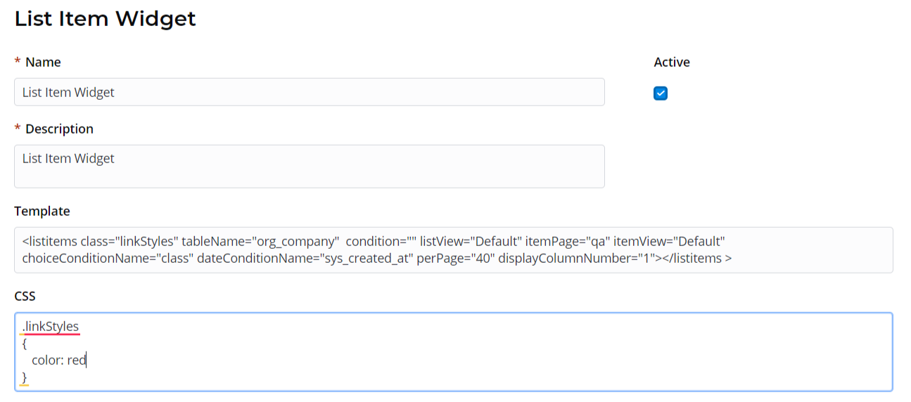
<listitems>
This widget allows displaying table items as a list view.
The following attributes are applicable:
Specify a list view to use (this view need to be created first in the UI list (sys_ui_list) dictionary).
Specify the path to a page in the portal structure.
Example:
If you set itemPage="page" as shown in code example below, then your URL may look like this:
Specify a condition applied to the list. This attribute should contain data of the Conditions type.
This attribute is to specify columns containing data of the Choice type if you need to specify choice options in your condition.
This attribute is to specify columns containing data of the Date or Date/Time type if you need to specify date ranges in your condition.
| Code Block | ||||||||
|---|---|---|---|---|---|---|---|---|
| ||||||||
<listitems class="linkStyles" tableName="itsm_incident" condition="" listView="Default" itemPage="page" itemView="view" choiceConditionName="class" dateConditionName="sys_created_at" perPage="25" displayColumnNumber="2"></listitems> |
<previewList>
This list view widget allows displaying table items as a customizable list.
The following attributes are applicable:
| Code Block | ||||||
|---|---|---|---|---|---|---|
| ||||||
<previewList tableName="announcement" view="AnnounceView" elementCount="3" subjectColumn="subject" dateColumn="sys_created_at" stateColumn="state" wrap="true" itemView="announceView"><ListHeader><div>Announcements</div></ListHeader></previewList> |
<results>
A widget responsible for displaying the Search results.
The following attributes are applicable:
Specify a path to a page in the portal structure.
Example:
If you set pageItem="page" as shown in code example below, then your search URL may look like this:
Example:
| Code Block | ||||||
|---|---|---|---|---|---|---|
| ||||||
<results searchQuery="{data.search}" tsGroupId="157018693719021198" quantity="4" itemPage="page" itemView="view"> |
<search>
A Search widget component responsible for search functionality.
Specify a path to a page in the portal structure..
Example:
If you set itemPage="page" as shown in code example below, then your search URL may look like this:
A text inside the search field.
Define a custom title instead of a default one.
To use a custom title, please set a showTitle attribute equal to true first.
| Code Block | ||||||||
|---|---|---|---|---|---|---|---|---|
| ||||||||
<search tsGroupId="157018693719021198" top="3" size="lg" itemPage="page" itemView="view" showTitle="1" onChange="s_widget_custom.search(arguments[0]);"> |
<sidemenu>
This widget adds a side-menu.
The following attributes are applicable:
| Code Block | ||||||||
|---|---|---|---|---|---|---|---|---|
| ||||||||
<SideMenu
simple-class="Main"
parentsDepth="1"
childrenDepth="1"
   includeCategories="1"
   includeItems="1">\
</SideMenu> |