The list interface includes the following elements:
- Columns – names of columns of the current table. Click a column name to open the context menu.
- Funnel
 – click this icon to use the condition builder for filtering.
 - List
 – click the icon to select the number of items diplayed displayed per page. The number of records displayed by default is configured in the Preferences menu.
 - Gear icon
 – click this icon to change the set and order of columns displayed.
 - Search boxes – click the magnifier icon to the left of column names to open the list search boxes. Here, enter the value that a column should contain to find certain records.
- List of records – records included in the table displayed in rows. You can select records using the checkboxes on the left to delete them or (in case it is a record picker) to select them for the list type field. By default, the records in lists are sorted by the ID column in descending order.
- Information icon
 – click this icon to see preview information about the record.
 - Cell – the column value of a certain record. You can change the value using DOC0000960: Lists Interface.
See the List Interface article to learn more about the available actions for users.

Configure the record number
To configure the number of records displayed in the lists, set the options in the simple.list.record_count_options.
To set the default number of record to be displayed in the lists, select the preferred option in the Number of records on lists field of the Preferences menu.
To set the number of record in specific lists, click
and select the desired number of record to display per page. The selected user options will be saved in user preferences.
The list.pagination.enable_pages_calculation property enables the counting of items for pagination.
The list.per_page property allows you to customize the number of records for the list by default.
- Navigate to System Properties → All Properties.
- Find the property record you need using the list search boxes or the condition builder and open it.
- In the Value field, enter the necessary value.
- Click Save or Save and exit.
Configure
the inline editing Anchor configure inline editing configure inline editing
| configure inline editing | |
| configure inline editing |
You need to select a relevant application in the Admin Preferences to edit records. Otherwise, the fields will be read-only.
You can lock selected columns for editing to protect them from being changed, bypassing client scripts.
To lock columns for editing, follow these steps:
- From the table form view, click Configure inline editing.

A modal window appears.
- Depending on your purpose, you can lock:
- a single column: start typing in the input field and select an item from the auto-suggest list.
- multiple columns:
- click the magnifier icon
 right to the input field. In the window that appears select the checkboxes corresponding to the columns you wish to lock and click Select items.
 - to remove a column from the input field, click the close button
 on its badge.
- click the magnifier icon
- all columns except for the selected ones: select Lock all columns except those specified below.
- all columns: switch Lock all columns.
When all settings are done, click Apply.
Note Unless Lock all columns is switched, you must fill in the Columns field to click Apply.
To revert the changes you have made, click Reset settings and click Reset in the dialog box that appears. The Reset settings button is only available if you made any configuration changes previously.
| Note |
|---|
|
Condition builder
The condition Condition builder is a tool that helps to create conditions to select fields with specific values and sort them in a particular order.
It is available for the following elements:
- lists (click the funnel icon above the table).
- forms in Condition fields.
- record picker window (click the magnifier icon by the reference fields).
- Related Lists area (click the funnel icon above the table).
To create filters, complete the following steps:
- Click the funnel icon to open the condition builder.
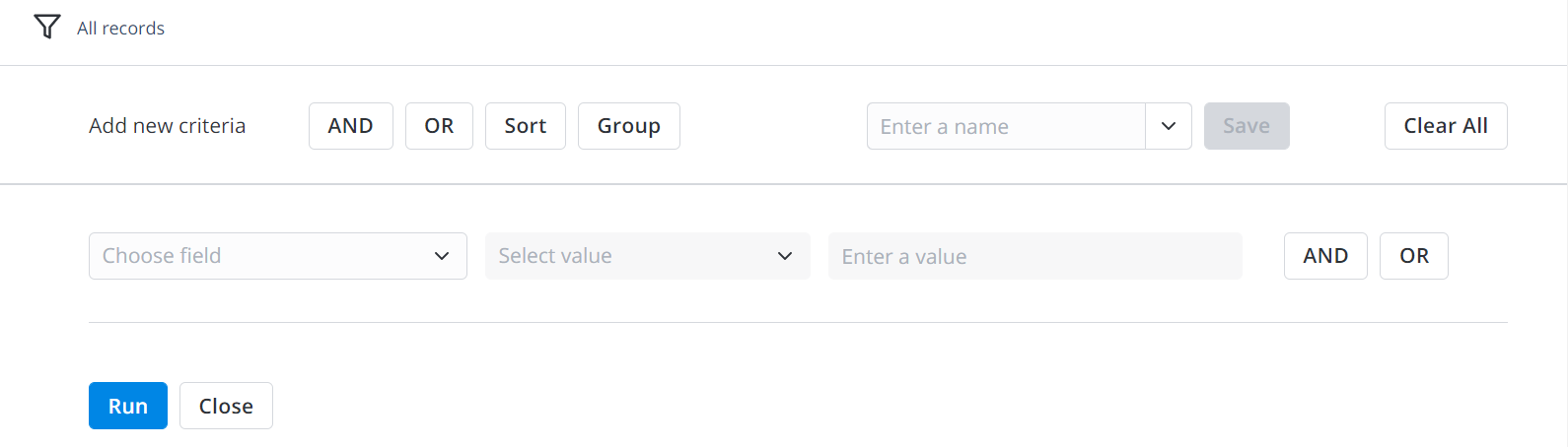
- Add complex conditions using the AND and OR actions buttons in the condition builder toolbar.
- ClickRun to apply filters and get the selection of records.
- You can also delete them by clicking Clear All.
| Panel | |||||||||||||||||||||||||||||||||||||||||
|---|---|---|---|---|---|---|---|---|---|---|---|---|---|---|---|---|---|---|---|---|---|---|---|---|---|---|---|---|---|---|---|---|---|---|---|---|---|---|---|---|---|
Other available actions:
|
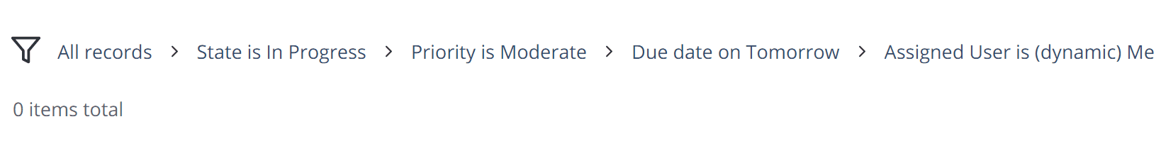
On lists and in dictionaries, you can find breadcrumbs by the funnel icon . They represent applied conditions:

| Tip |
|---|
To clear filters of the condition builder:
To add a list filter to the Favorites menu, drag and drop it to the Favorites navigation tab. |
See the Condition Builder article to learn more.
Grouping on lists Anchor grouping on lists grouping on lists
| grouping on lists | |
| grouping on lists |
Grouping is available only on lists. Records in related lists cannot be grouped.
To configure the number of groups displayed on the page, set the list_groups.per_page property value.
To set up properties, follow the steps below:
- Navigate to System Properties → All Properties.
- Find the property record you need using the list search boxes or the condition builder and open it.
- In the Value field, enter the necessary value.
- Click Save or Save and Exit.
Create a report
Use the the title context menu by right-clicking the list titles and selecting one of the following options:
- Pie Chart – present data with the circular statistical graphics. See the Reports article to learn more.
- Bar Chart – present data with rectangular bars.
Import and export
Use the title context menu by right-clicking the list titles and selecting one of the following options:
- Export Excel – export the list into an Excel file, to use it later for various purposes. See the Quick Export (outdated) article to learn more.
- Export to JSON – export the list view into a JSON-formatted file , to use it later for various purposes.
- Import from JSON – import a JSON-formatted file to file, to insert records to the database directly. See the Quick Import article to learn more.
| Table of Contents | ||||||
|---|---|---|---|---|---|---|
|