In SimpleOne, forms display
individual systemtable records along with the information stored as column values. Form fields of various types are intended to display this data on forms and allow users to interact with it.
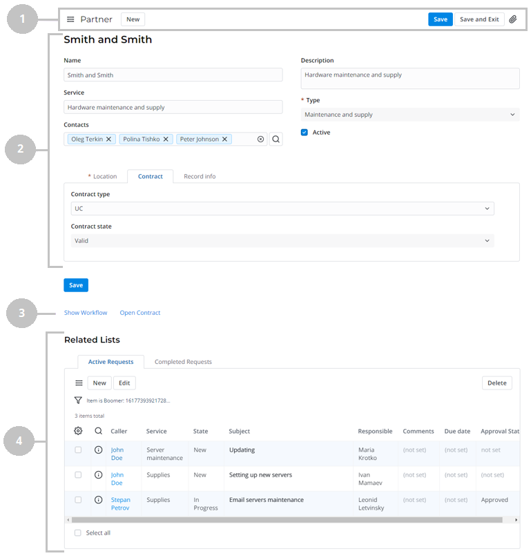
Record form
A record form consists of the following parts:
- Header area – contains the name of the table, the burger menu
 , the available user interface actions, and the presence indicator.
 Main area – contains the record title and the record fields.
Info The Default section is displayed first.
- Related Links area – contains user interface actions in the form of links.
- Related Lists area – contains the lists of records from tables connected with the current one.
Access to records
If you do not have access rights to view some records, reference fields will display the following badges:
- If a field refers to a record unavailable to you, a gray badge with the
 unavailable data text is displayed. You can remove the record from the field by clicking
  to the right of the badge, but you cannot navigate to its form.
 - If an ACL rule restricts access to the Display Name of a record, then a blue badge with the unavailable title text is displayed. You can remove the record from the field by clicking to the right of the badge and navigate to its form via the pop-up window.
- If the referenced record is deleted, the field will display a gray badge with the record not found text. You can remove the record from the field by clicking to the right of the badge.
If a deleted column is selected in the field, the Column not found placeholder is displayed. Under the field, the following hint is displayed: Selected record is not found, choose another one.
When you do not have access to some records in the Related Lists area, the following message is displayed: Some entries are hidden by security policy.
Configure the presence indication
The presence indicator appears when other users interact with the same form as the current user. It displays the number of users currently interacting with the record. If only the current user interacts with the record, the presence indicator is hidden.
To enable the presence indicator for a table, select the Indicate presence checkbox when creating or configuring it and add the IndicatePresence widget to the form layout.
When clicked, the indicator shows the dropdown list of users that currently interact with the record.

By default, the profile picture, name and an optional line, containing the user's job title, are displayed in the dropdown list. To change the information displayed in the optional line or hide it, edit the simple.presence_indication.additional_info_column_name system property.
Configure a form layout
| Tip |
|---|
Role required: admin. |
Configuring form layouts allows administrators to You can change the form views for the various business tasks. Creating separate by configuring form layouts. Separate form views with sets of fields and and widgets is are useful for users with different processes or user rolesroles who process various tasks.
| Info |
|---|
Use form layouts to create and configure the view of the tables. Use Client Scripts to change form field visibility dynamically dependent on user client scripts to dynamically change form field visibility, depending on user roles, fields state, or form state (inserting/updating). |
Form view displays the elements in the order below:
Form sections containing:widgets
| Tooltip | ||||||
|---|---|---|---|---|---|---|
| ||||||
Refer to the Adding Widget to Form article to learn more. |
| Info |
|---|
The Default section is displayed first. |
. |
Every SimpleOne system table has a Default form view that administrators can configure using the form layout features.
Configure form layoutTo change a form layout, follow the steps below:
- On the record form, enter in the hamburger menu and select burger menu
 , select Configure → Form → Layout to open the Form layout configure menu.
 - In the Form view and section area, the View name displays the view you entered opened this menu from. If you want need to change another form view, select it in this field.
- Configure your form view by with the following actions:
- Configure a set of fields in the Default and custom sectionsin sections.
- Add new form sections.
- Split sections into vertical columns.
- Click Save.
| Tip |
|---|
To configure the Related Lists displayed on the form, in the hamburger menu |
You can create separate form views with sets of fields for different processes or user roles. The system stores all the list and form views created along with their layout elements as table records. See Form Elements to learn more.
Create a
newform view
To create a separate view, please complete the steps below:
- On the record form, enter in the hamburger burger menu
and , select Configure → Form → Layout to open the Form layout configure menu.
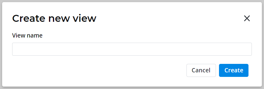
- In the Form view and section area, click Add new next to the View name field.
- In the modal window appearedthat appears, enter the desired view name and click Create.
- Configure the fields to display by moving them from the Available to Selected layout area box to the Selected box.
- (Optionaloptional) Use the Section option to add more form sections by clicking Add new if you need.
- Click Save to apply the changes and leave the configure menu.
| Note |
|---|
If you leave the configure menu without clicking the Save button, then the pop-up window will appear. Click OK to save changes or click Cancel to discard them. |
Please note that when a new form view is created, it is empty by default.
Also, please note 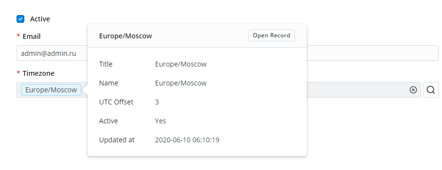
| Info |
|---|
Refer to the Customizing portal and agent views article to learn how to change the set of displayed fields.
|
|
|
|
|
|
Configure a form section
Sections are needed for separating the fields in a sensible and visual wayWith sections, you can logically and visually separate the fields on the form.
The Default section section displays the table fields grouped on the main area of the form (in the Section menu, this option is always on top of the sections list). Custom sections display a set of fields in on separate tabs in at the bottom of the form above the the Related Lists.

| Info |
|---|
The Available layout Available layout area contains all the table fields that can be embedded in the form by adding them to the Selected layout area. Move elements by drag-and-dropping dragging them or using the the
|
Create a
newsection
To create a new section and fill it with fields, follow the steps below:
- On the record form, enter in the hamburger menu and select burger menu, select Configure → Form → Layout to open the Form layout configure menu.
- On the Form view and section area, click Add new next to the Section field.
- In the modal window appearedthat appears, enter the desired section name and click Create.
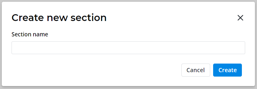
- With the created section selected, configure the fields to display by moving them from the Available to Selected layout areaAvailable box to the Selected box.
- Click Save to apply changes and leave the configure menu.
| Note |
|---|
If you leave the configure menu without clicking the Save button, then the pop-up window will appear. Click OK to save changes or click Cancel to discard them. |
- configuration menu.
| Info | ||
|---|---|---|
| ||
You can change sections order by drag-and-dropping dragging them in the Section menu or clicking clicking the |
Split
thesection fields
Refer to the Adding
You can configure how fields and widgets are placed on the form
| onlyIcon | true |
|---|---|
| appendIcon | info-filled |
| iconColor | blue |
. See the Add Widget to Form article to learn
morehow to add widgets.
. By default, they go from top to bottom in one column. Begin split and End split are not necessary for a form layout organized in one column. If you need to rearrange them in two or more columns, you can use splitters for thissplits.

To split the fields into columns, follow the steps below:
Click Begin split to add the |-begin-split-| element to the Selected layout area box. Move this element to specify where the split area starts.
- Click End split to add the |-end-split-| element to the Selected layout area box. Move this element to specify where the split area ends.
Click Split to add the|-split-| element to the Selected layout area box. Move this element between |-begin-split-| and |-end-split-| to set the place where a column endsthe fields are splitted.
- (Optional) Add more|-split-| elements in the area between |-begin-split-| and |-end-split-|, if you want need to rearrange form fields in more than two columns.
- (Optional) Add more sets of |-begin-split-|, |-split-| and |-end-split-| elements within the existing ones to create a nested splitting. For thisTo do so, put the elements between the existing existing |-begin-split-| and |-end-split-|. These splits create subcolumns within a column. The number of nested splittings is unlimited.
- Click Save to apply changes and leave the configure menu.
- the
- changes
- .
| Tip |
|---|
If you omit the|-begin-split-| element, all fields above the |-split-| element will be considered the rightmost column in the Selected layout area ( box as if there is a |-begin-split-| element above them). Please note Note that the |-begin-split-| element is obligatory for nested splittings. |
| Info |
|---|
The splitters appear at the bottom of the Selected layout area box if no fields are highlighted. If a field is highlighted, the split element appears right after it. Drag -and-drop them or using the the |
In the example below, the form is divided into two columns:
- Table, Column Typetype, Title, Column Name.name
- Active, Read Onlyonly, Mandatory, Full Text Searchtext search, Display by Refref, Unique.
Within the second column there is an nested splitting with two columns:
- Read Onlyonly, Mandatory;
- Full Text Searchtext search, Display by Ref.ref


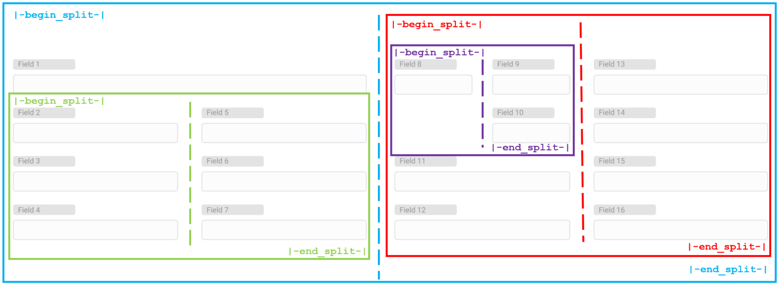
Configure a complex form layout
configurationIn the following example, we examine a case of creating a complex form layout is created. Dashed lines in the screenshots below represent the |-split-| element.
Basic layout structure is the following:
| Section | ||||
|---|---|---|---|---|
| ||||
It is easier to grasp the idea if you imagine every separate block of columns as boxes which sides are the |-begin_split-| and the |-end_split-| elements. So, basically you put boxes inside other boxes. | ||||

You can create unlimited number of columns or divide columns within other columns as in the picture below. A complex form layout is broken divided into component parts. You can use this scheme to create your own complex layout.
| Expand | ||
|---|---|---|
| ||
The form consists of four field groups: Blue, Red, Green, and Purple. The Blue group divides the form layout into 2 general columns. This is the basis of the form layout. To recreate this form, perform the following steps:
|
|
|
Configure
Related Liststhe related list area
Related lists Lists appear at the bottom of the forms forms and show records in tables that have relationships with the current record. For example, on the change User form, related lists can display approval User Role lists; on the Task form, they can display SLA indicators with the relevant values, and so on, depending on the business needs.
To configure related lists, complete the steps below:
- Open the form you need to reconfigure.
- Enter the hamburger menu
- Select Form Layout → Related Lists.
You can add or remove related lists the same way as the fields.
| Info |
|---|
|
Relationships configuring
In SimpleOne, apart from regular related lists, there are also scripted relationships implemented too. Unlike the related lists, scripted relationships use scripts to query to the related tables.
To learn more about how to configure a scripted relationship, please refer to the Scripted Related Lists article.User Role lists. See the Related Lists article to learn how to add them to the layot.
Form view of a VCS record
The VCS record form aggregates all the elements of the form related to it: UI form element (sys_ui_form_element), Form section (sys_ui_form_section), Related list (sys_ui_related_list), and Related list element (sys_ui_related_list_element). They are stored in the JSON (Copy) field.
See a scheme content of a VCS record below:
VCS Record
|
A JSON (copy) field stores the data about all the related elements in the following way:
| Expand | |||||||
|---|---|---|---|---|---|---|---|
| |||||||
|
| Table of Contents | ||||
|---|---|---|---|---|
|
/