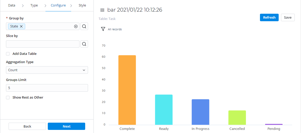
Bar
Bar reports display categorized data in the form of vertical bars whose length is proportional to the data values. Group bars to make the chart representation visual and clear.
This report view is useful for dividing data into categories and comparing them.
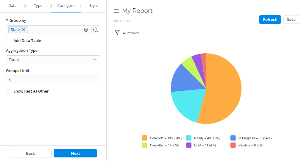
Pie
Pie reports display data in the form of a circular graph divided into slices. Each slice proportionally displays a particular data category.
This report view is useful to compare the for comparing the proportions of individual values to the whole. The pie chart is the most obvious choice when the number of categories is small.
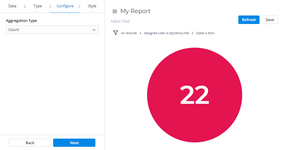
Gauge
Gauge reports present a single metric value from the data via the gauge panel with a dial on it.
This report view is useful for evaluating the criticality according to the established limits.

Digit
Digit reports provide a simple digit representation of a single metric value.
This report view is useful for monitoring the critical parameters by using a clear visual presentation.
Line
Line reports present data as a graph of points connected by a line and visualize the metric data values.
This report view is useful for comparing data per time period (years, months, etc.).
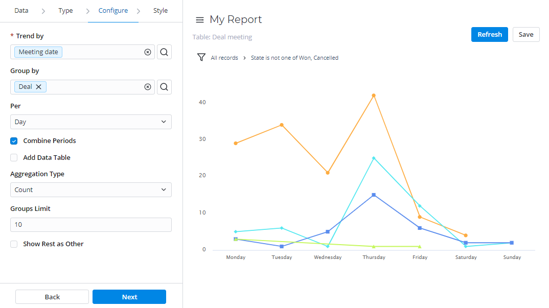
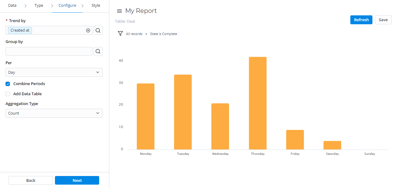
Trend
Trend reports show the dynamics of data changes. The data is presented in the form of columns divided by periods of time.
This report type is useful for monitoring time parameters.
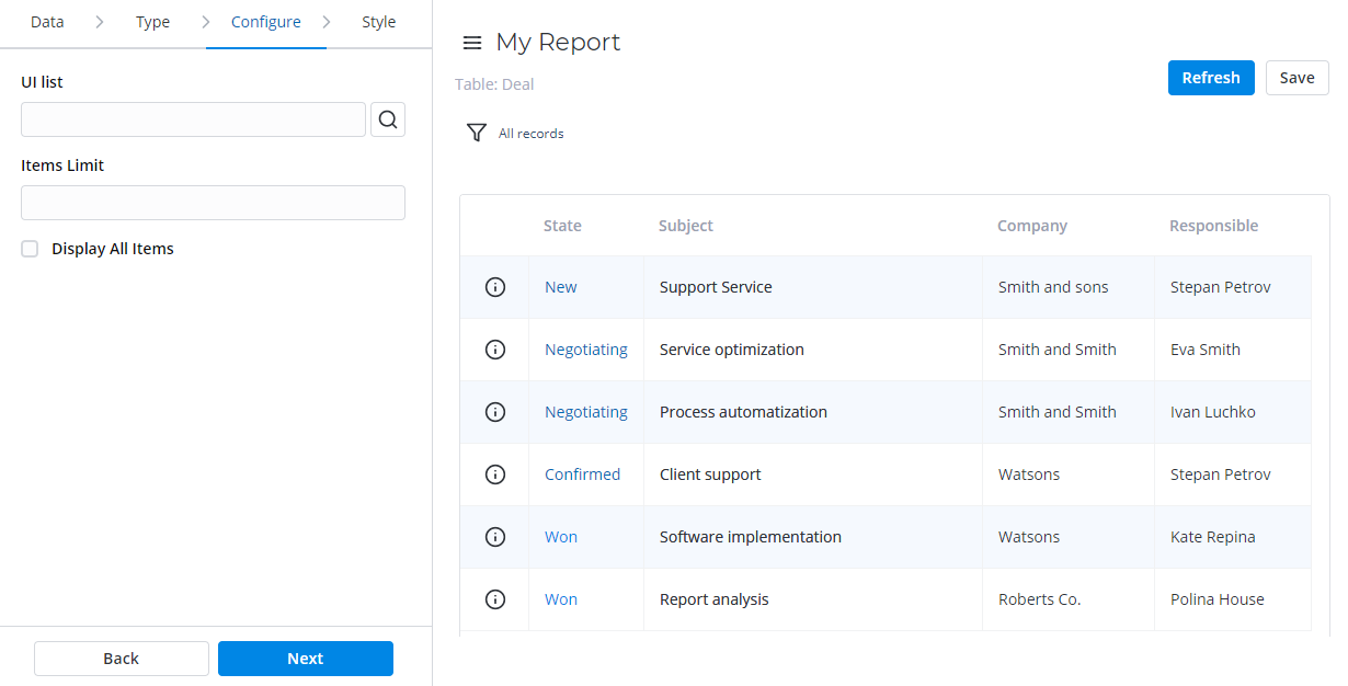
List
List reports represent table data in the form of a list view.
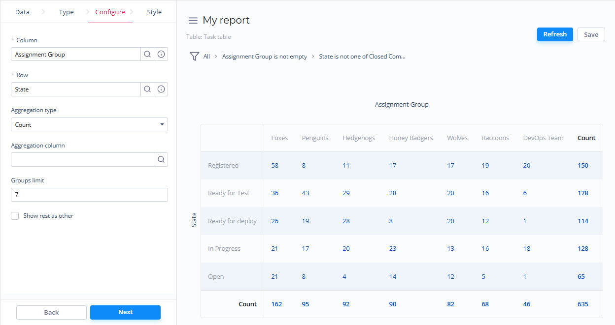
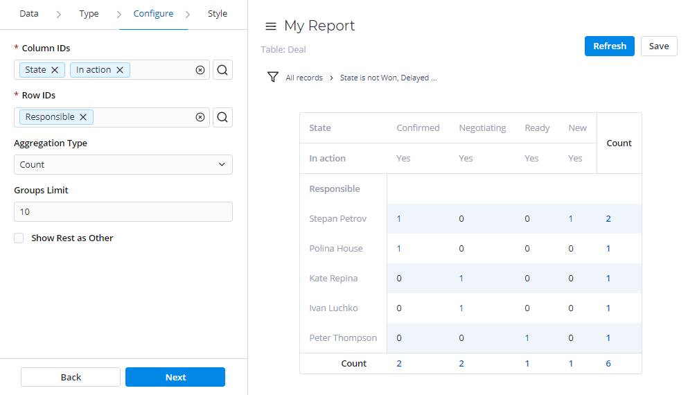
Pivot Table
Pivot reports present your data in the form of a table view. The data is analyzed, aggregated, and grouped based on two metrics (as rows and columns).
This report view is useful for comparing, summarizing, and counting a large amount of data.
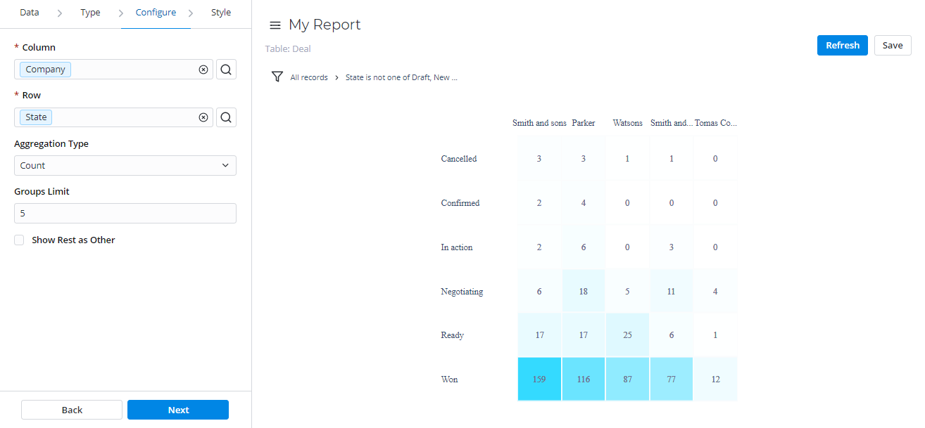
Heatmap
Heatmap reports display your data as the intersection of two metrics in a table with colored cells. These cells contain data values visualized with different color brightnessshades.
Multilevel Pivot Table
Multilevel Pivot Tables reports represent your data in the form a table view. The data is aggregated, grouped, and analyzed based on two metrics (as rows and columns).
This report view is extremely useful of useful for comparing, summarizing, and counting a large amount of data.
| Table of Contents | ||||||
|---|---|---|---|---|---|---|
|