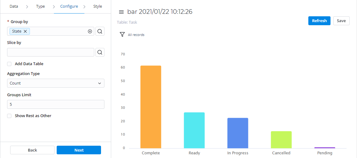
Bar
Bar reports display categorized data in the form of vertical bars whose length is proportional to the data values. Group bars to make the chart representation visual and clear.
This report view is useful for dividing data into categories and comparing them.
Configure tab
| Field | Mandatory | Description |
|---|---|---|
| Group by | Y | Select table columns as criteria for data grouping. |
| Slice by | N | Select a table column as a slice criterion and configure a Slice Type. |
| Slice Type | N | Select the type of data slice:
The Slice Type field appears if the Slice by option is specified. |
| Add Data Table | N | Select this checkbox to display the data table below your report view. |
| Aggregation Type | N | Select the data aggregation to create combined datasets for data processing. Available options:
The Sum and Average settings make sense if the aggregation column keeps the numeric data. When this aggregation option is selected, it is applied to the table column set in the Aggregation Column field. |
| Aggregation Column | Y | Select a table column with numeric values for data aggregation. The Aggregation Column field is available only if the Aggregation Type option is set to one of the following: Average, Count Distinct, Sum. |
| Groups Limit | N | Set the limit of the data groups shown in your report with a particular number in this field. |
| Show Rest as Other | N | Select this checkbox to show the data groups not included in Groups Limit as one. The Show Rest as Other field is available only if the Groups Limit option is specified. |
Style tab
| General | ||
|---|---|---|
| Field | Mandatory | Description |
| Chart Color Type | N | Select the color type of your bar chart:
|
| Color | N | Set the color for your bar chart if you selected Use one color as the color type. Click the magnifier icon |
| Palette | N | Set the desired color palette for your bar chart if you selected Use color palette as the color type. Click the magnifier icon |
| Display Data Labels | N | Select this checkbox to display data labels on your bar chart. |
| Drilldown List Layout | N | Use this option to configure the view of the data slice drilled down. Click the magnifier icon See Personal list layout if you want to configure the list view. |
| Decimal Precision | N | Define how many numbers should be displayed after the point of numeric data values in your chart. This field appears when the Aggregation Type field on the Configure tab contains Sum or Average. |
| Title | ||
| Field | Mandatory | Description |
| Report Title Show Type | N | Select the type for the report title showing. Available options:
|
| Report Title | N | Specify the title of the report. |
| Report Title Size | N | Specify the number of pixels to set the size of the report title. |
| Report Title Color | N | Select the color of the report title. Click the magnifier icon |
| Title Alignment | N | Set the alignment of the report title. Available options:
|
| Bold Title | N | Select this checkbox to make the report title bold. |
| X | ||
| Field | Mandatory | Description |
| X Title | N | Specify the title name for the X-axis for your chart. |
| X Title Size | N | Define the number of pixels to set the size for the title of the X-axis. |
| X Title Bold | N | Select this checkbox to make the title of the X-axis bold. |
| X Display Opposite | N | Select this checkbox to make the X-axis display opposite. |
| X Display Grid | N | Select this checkbox to display the grid of the X-axis. |
| X Grid Dotted | N | Select this checkbox to make the X-axis grid dotted. Use this checkbox with the X Display Grid field selected. |
| X Label Size | N | Define the number of pixels to set the size of the X label. |
| Y | ||
| Y Title | N | Specify the title name for the Y-axis for your chart. |
| Y Title Size | N | Define the number of pixels to set the size for the title of the Y-axis. |
| Y Title Bold | N | Select this checkbox to make the title of the Y-axis bold. |
| Y Display Opposite | N | Select this checkbox to make the Y-axis display opposite. |
| Y Display Grid | N | Select this checkbox to display the grid of the Y-axis. |
| Y Grid Dotted | N | Select this checkbox to make the Y-axis grid dotted. Use this checkbox with the Y Display Grid field selected. |
| Y from | N | Set the Y value used as the chart starting point. |
| Y to | N | Set the Y value used as the chart endpoint. |
| Y Label Size | N | Define the number of pixels to set the size of the Y label. |
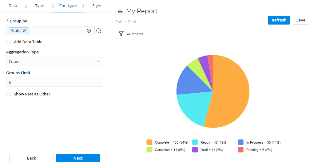
Pie
Pie reports display data in the form of a circular graph divided into slices. Each slice proportionally displays a particular data category.
This report view is useful for comparing the proportions of individual values to the whole. The pie chart is the most obvious choice when the number of categories is small.
Configure tab
| Field | Mandatory | Description |
|---|---|---|
| Group by | Y | Select table columns as criteria for data grouping. |
| Add Data Table | N | Select this checkbox to display the data table below your report view. |
| Aggregation Type | N | Select the data aggregation to create combined datasets for data processing. Available options:
The Sum and Average settings make sense if the aggregation column keeps the numeric data. When this aggregation option is selected, it is applied to the table column set in the Aggregation Column field. |
| Aggregation Column | N | Select a table column with numeric values for data aggregation. The Aggregation Column field is available only if the Aggregation Type option is set to one of the following: Average, Count Distinct, Sum. |
| Groups Limit | N | Set the limit of the data groups shown in your report. |
| Show Rest as Other | N | Select this checkbox to show the data groups not included in Groups Limit as one. The Show Rest as Other field is available only if the Groups Limit option is specified. |
Style tab
| General | ||
|---|---|---|
| Field | Mandatory | Description |
| Chart Color Type | N | Select the color type of your pie chart:
|
| Color | N | Set the color for your pie chart if you selected Use one color as the color type. Click the magnifier icon |
| Palette | N | Set the desired color palette for your pie chart if you selected Use color palette as the color type. Click the magnifier icon |
| Display Data Lables | N | Select this checkbox to display the data labels on your pie chart. |
| Drilldown List Layout | N | Use this option to configure the view of the data slice drilled down. Click the magnifier icon See Personal list layout if you want to configure the list view. |
| Decimal Precision | N | Define how many numbers should be displayed after the point of numeric data values in your chart. This field appears when the Aggregation Type field on the Configure tab contains Sum or Average. |
| Title | ||
| Field | Mandatory | Description |
| Report Title Show Type | N | Select the type for the report title showing. Available options:
|
| Report Title | N | Specify the title of the report. |
| Report Title Size | N | Specify the number of pixels to set the size of the report title. |
| Report Title Color | N | Select the color of the report title. Click the magnifier icon |
| Title Alignment | N | Select the alignment of the report title. Available options:
|
| Bold Title | N | Select this checkbox to make the report title bold. |
| Legend | ||
| Field | Mandatory | Description |
| Show Legend | N | Select this checkbox to display the chart legend. |
| Legend Alignment | N | Set the alignment of the chart legend. Available options:
|
| Show Legend Border | N | Select this checkbox to display the border of your chart legend. |
Gauge
Gauge reports present a single metric value from the data via the gauge panel with a dial on it.
This report view is useful for evaluating the criticality according to the established limits.

Configure tab
| Field | Mandatory | Description |
|---|---|---|
| Aggregation Type | N | Select the data aggregation to create combined datasets for data processing. Available options:
The Sum and Average settings make sense if the aggregation column keeps the numeric data. When this aggregation option is selected, it is applied to the table column set in the Aggregation Column field. |
| Aggregation Column | N | Select a table column with numeric values for data aggregation. The Aggregation Column feld is available only if the option is set to one of the following: Average, Count Distinct, Sum. |
| Maximum Value | N | Define the maximum value for the data set as the Aggregation Column. |
| Minimum Value | N | Define the minimum value for the data set as the Aggregation Column. |
Style tab
| General | ||
|---|---|---|
| Field | Mandatory | Description |
| Chart Color | N | Select the color type of your report chart:
|
| Color | N | Set the color for your gauge report if you selected Use one color as the color type. Click the magnifier icon |
| Lower Limit | N | Enter the lower limit value for the gauge report metric. All data values below this limit are considered low scores and are painted in Low Score Color. |
| Upper Limit | N | Enter the upper limit value for the gauge report metric. All data values below this limit are considered middle scores and painted in Middle Score Color. |
| Low Score Color | N | Set the color for values below the Lower Limit. |
| Middle Score Color | N | Set the color for values below the Upper Limit and above the Lower Limit. |
| High Score Color | N | Set the color for values above the Upper Limit. |
| Drilldown List Layout | N | Use this option to configure the view of the data slice drilled down. Click the magnifier icon See Personal list layout if you want to configure the list view. |
| Decimal Precision | N | Define how many numbers should be displayed after the point of numeric data values in your chart. This field appears when the Aggregation Type field on the Configure tab contains Sum or Average. |
| Title | ||
| Field | Mandatory | Description |
| Report Title Show Type | N | Select the type for the report title showing. Available options:
|
| Report Title | N | Specify the title of the report. |
| Report Title Size | N | Specify the number of pixels to set the size of the report title. |
| Report Title Color | N | Select the color of the report title. Click the magnifier icon |
| Title Alignment | N | Select the alignment of the report title. Available options:
|
| Bold Title | N | Select this checkbox to make the chart title bold. |
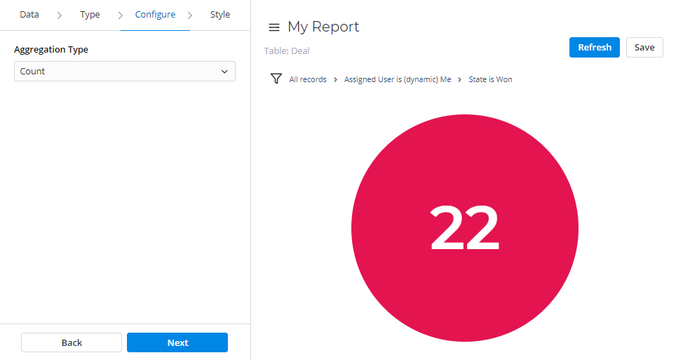
Digit
Digit reports provide a simple digit representation of a single metric value.
This report view is useful for monitoring the critical parameters by using a clear visual presentation.
Configure tab
Field | Mandatory | Description |
|---|---|---|
| Aggregation Type | N | Select the data aggregation to create combined datasets for data processing. Available options:
The Sum and Average settings make sense if the aggregation column keeps the numeric data. When this aggregation option is selected, it is applied to the table column set in the Aggregation Column field. |
| Aggregation Column | Y | Select a table column with numeric values for data aggregation. The Aggregation Column field is available only if the Aggregation Type option is set to one of the following: Average, Count Distinct, Sum. |
Style tab
| General | ||
|---|---|---|
| Field | Mandatory | Description |
| Drilldown List Layout | N | Use this option to configure the view of the data slice drilled down. Click the magnifier icon See Personal list layout if you want to configure the list view. |
| Decimal Precision | N | Define how many numbers should be displayed after the point of numeric data values in your chart. This field appears when the Aggregation Type field on the Configure tab contains Sum or Average. |
| Color | N | Set the color for your digit chart. Click the magnifier icon |
| Title | ||
| Field | Mandatory | Description |
| Report Title Show Type | N | Select the type for the report title showing. Available options:
|
| Report Title | N | Specify the title of the report you create. |
| Report Title Size | N | Specify the number of pixels to set the size of the report title. |
| Report Title Color | N | Select the color of the report title. Click the magnifier icon |
| Title Alignment | N | Select the alignment of the chart title selecting one of these options:
|
| Bold Title | N | Select this checkbox to make the chart title bold. |
Line
Line reports present data as a graph of points connected by a line and visualize the metric data values.
This report view is useful for comparing data per time period (years, months, etc.).
Configure tab
| Field | Mandatory | Description |
|---|---|---|
| Trend by | Y | Select the table column of the Date/Time type to use it as a timeline period. |
| Group by | N | Select table columns as criteria for data grouping. |
| Per | N | Select a period as a grouping criterion. Available options:
|
| Combine Periods | N | Select this checkbox to combine data changes over the same period. |
| Add Data Table | N | Select this checkbox to display the data table below your report view. |
| Aggregation Type | N | Select the data aggregation to create combined datasets for data processing. Available options:
The Sum and Average settings make sense if the aggregation column keeps the numeric data. When this aggregation option is selected, it is applied to the table column set in the Aggregation Column field. |
| Aggregation Column | N | Select a table column with numeric values for data aggregation. The Aggregation Column field is available only if the Aggregation Type option is set to one of the following: Average, Count Distinct, Sum. |
| Groups Limit | N | Set the limit of the data groups shown in your report with a particular number in this field. The field appears when the Group by field is filled in. |
| Show Rest as Other | N | Select this checkbox to show the data groups not included in Groups Limit as one. The Show Rest as Other field is only available if the Groups Limit option is specified. |
Style tab
| General | ||
|---|---|---|
| Field | Mandatory | Description |
| Chart Color Type | N | Select the color type of your line chart:
|
| Color | N | Set the color for your line chart if you selected Use one color as the color type. Click the magnifier icon |
| Palette | N | Set the desired color palette for your line chart if you selected Use color palette as the color type. Click the magnifier icon |
| Display Data Labels | N | Select this checkbox to display the data labels on your line chart. |
| Drilldown List Layout | N | Use this option to configure the view of the data slice drilled down. Click the magnifier icon See Personal list layout if you want to configure the list view. |
| Decimal Precision | N | Define how many numbers should be displayed after the point of numeric data values in your chart. This field appears when the Aggregation Type field on the Configure tab contains Sum or Average. |
| Title | ||
| Field | Mandatory | Description |
| Report Title Show Type | N | Select the type for the report title showing. Available options:
|
| Report Title | N | Specify the title of the report you create. |
| Report Title Size | N | Specify the number of pixels to set the size of the report title. |
| Report Title Color | N | Select the color of the report title. Click the magnifier icon |
| Title Alignment | N | Select the alignment of the report title. Available options:
|
| Bold Title | N | Select this checkbox to make the report title bold. |
| X | ||
| Field | Mandatory | Description |
| X Title | N | Specify the title name for the X-axis for your chart. |
| X Title Size | N | Define the number of pixels to set the size for the title of the X-axis. |
| X Title Bold | N | Select this checkbox to make the title of the X-axis bold. |
| X Display Opposite | N | Select this checkbox to make the X-axis display opposite. |
| X Display Grid | N | Select this checkbox to display the grid of the X-axis. |
| X Grid Dotted | N | Select this checkbox to make the X-axis grid dotted. Use this checkbox with the X Display Grid field selected. |
| X Label Size | N | Specify the number of pixels to set the size of the X label. |
| Y | ||
| Field | Mandatory | Description |
| Y Title | N | Specify the title name for the Y-axis for your chart. |
| Y Title Size | N | Define the number of pixels to set the size for the title of the Y-axis. |
| Y Title Bold | N | Select this checkbox to make the title of the Y-axis bold. |
| Y Display Opposite | N | Select this checkbox to make the Y-axis display opposite. |
| Y Display Grid | N | Select this checkbox to display the grid of the Y-axis. |
| Y Grid Dotted | N | Select this checkbox to make the Y-axis grid dotted. Use this checkbox with the Y Display Grid field selected. |
| Y from | N | Set the Y value used as the chart starting point. |
| Y to | N | Set the Y value used as the chart endpoint. |
| Y Label Size | N | Define the number of pixels to set the size of the Y label. |
| Legend | ||
| Field | Mandatory | Description |
| Show Legend | N | Select this checkbox to display the chart legend. |
| Legend Alignment | N | Set the alignment of the chart legend. Available options:
|
| Show Legend Border | N | Select this checkbox to display the border of your chart legend. |
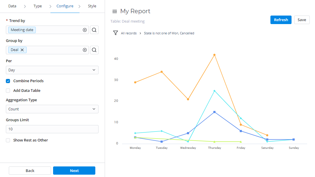
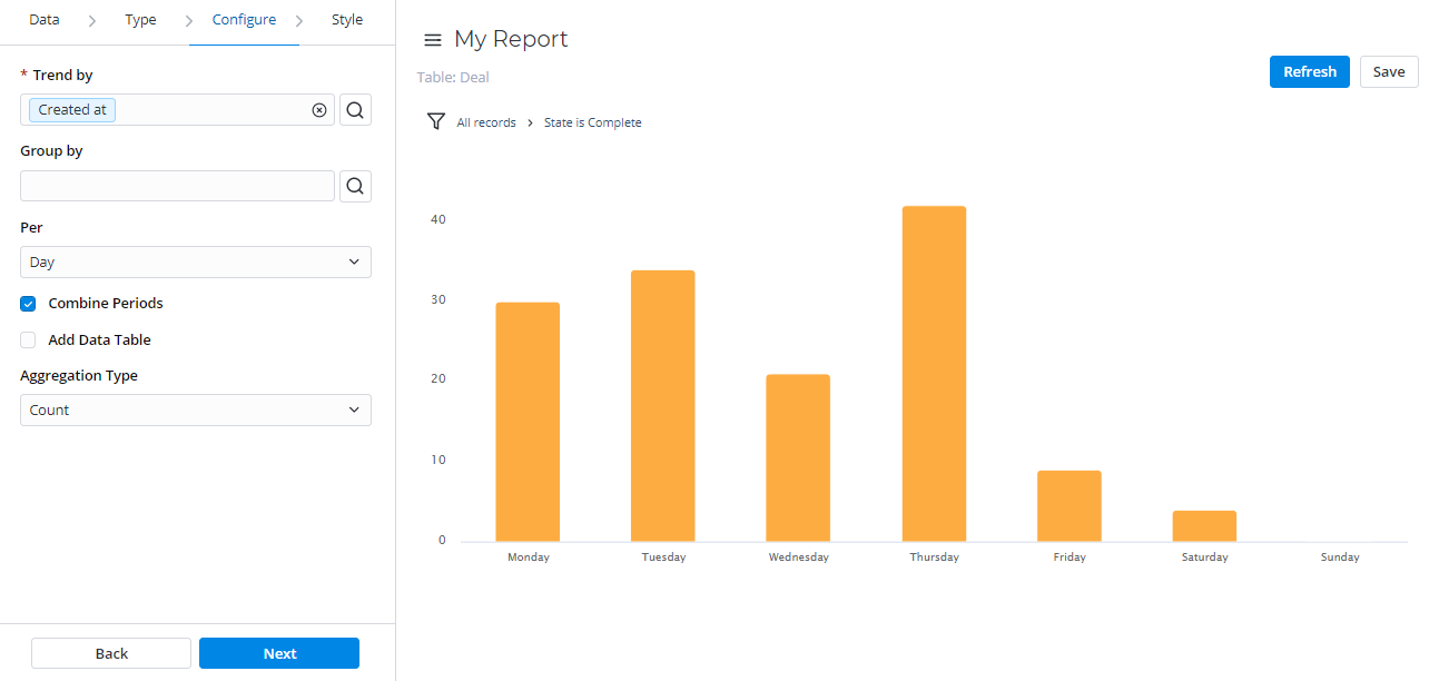
Trend
Trend reports show the dynamics of data changes. The data is presented in the form of columns divided by periods of time.
This report type is useful for monitoring time parameters.
Confugure tab
| Field | Mandatory | Description |
|---|---|---|
| Trend by | Y | Select a column of the Date/Time type to use it as a time parameter you want to monitor. |
| Group by | N | Select table columns as criteria for data grouping. |
| Per | N | Select a time period for the data changed:
|
| Combine Periods | N | Select this checkbox to combine data changes over the same period with each other. |
| Add Data Table | N | Select this checkbox to display the data table below your report view. |
| Aggregation Type | N | The data aggregation allows preparing the combined datasets for data processing according to the user needs. Select a type of the data aggregation with one of these options:
The Sum and Average settings make sense if the aggregation column keeps the numeric data. When this aggregation option is selected, it is applied to the table column set in the Aggregation Column field. |
| Aggregation Column | Y | Select a table column with numeric values for data aggregation. The Aggregation Column field is available only if the Aggregation Type option is set to one of the following: Average, Count Distinct, Sum. |
| Groups Limit | N | Set the limit of the data groups shown in your report with a particular number in this field. The field appears when the Group by field is filled in. |
| Show Rest as Other | N | Select this checkbox to show the data groups not included in Groups Limit as one. The Show Rest as Other field is available only if the Groups Limit option is specified. |
Style tab
| General Style | ||
|---|---|---|
| Field | Mandatory | Description |
| Chart Color Type | N | Select the color type of your trend chart:
|
| Color | N | Set the color for your trend chart if you selected Use one color as the color type. Click the magnifier icon |
| Palette | N | Set the desired color palette for your trend chart if you selected Use color palette as the color type. Click the magnifier icon |
| Display Data Labels | N | Select this checkbox to display the data labels on your trend chart. |
| Drilldown List Layout | N | Use this option to configure the view of the data slice drilled down. Click the magnifier icon See Personal list layout if you want to configure the list view. |
| Decimal Precision | N | Define how many numbers should be displayed after the point of numeric data values in your chart. This field appears when the Aggregation Type field on the Configure tab contains Sum or Average. |
| Title Style | ||
| Field | Mandatory | Description |
| Report Title Show Type | N | Select the type for the report title showing. Available options:
|
| Report Title | N | Specify the title of the report you create. |
| Report Title Size | N | Specify the number of pixels to set the size of the report title. |
| Report Title Color | N | Select the color of the report title. Click the magnifier icon |
| Title Alignment | N | Select the alignment of the report title. Available options:
|
| Bold Title | N | Select this checkbox to make the report title bold. |
| X | ||
| Field | Mandatory | Description |
| X Title | N | Specify the title name for the X-axis for your chart. |
| X Title Size | N | Define the number of pixels to set the size for the title of the X-axis. |
| X Title Bold | N | Select this checkbox to make the title of the X-axis bold. |
| X Display Opposite | N | Select this checkbox to make the X-axis display opposite. |
| X Display Grid | N | Select this checkbox to display the grid of the X-axis. |
| X Grid Dotted | N | Select this checkbox to make the X-axis grid dotted. Use this checkbox with the X Display Grid field selected. |
| X Label Size | N | Define the number of pixels to set the size of the X label. |
| Y | ||
| Field | Mandatory | Description |
| Y Title | N | Specify the title name for the Y-axis for your chart. |
| Y Title Size | N | Define the number of pixels to set the size for the title of the Y-axis. |
| Y Title Bold | N | Select this checkbox to make the title of the Y-axis bold. |
| Y Display Opposite | N | Select this checkbox to make the Y-axis display opposite. |
| Y Display Grid | N | Select this checkbox to display the grid of the Y-axis. |
| Y Grid Dotted | N | Select this checkbox to make the Y-axis grid dotted. Use this checkbox with the Y Display Grid field selected. |
| Y from | N | Set the Y value used as the chart starting point. |
| Y to | N | Set the Y value used as the chart endpoint. |
| Y Label Size | N | Define the number of pixels to set the size of the Y label. |
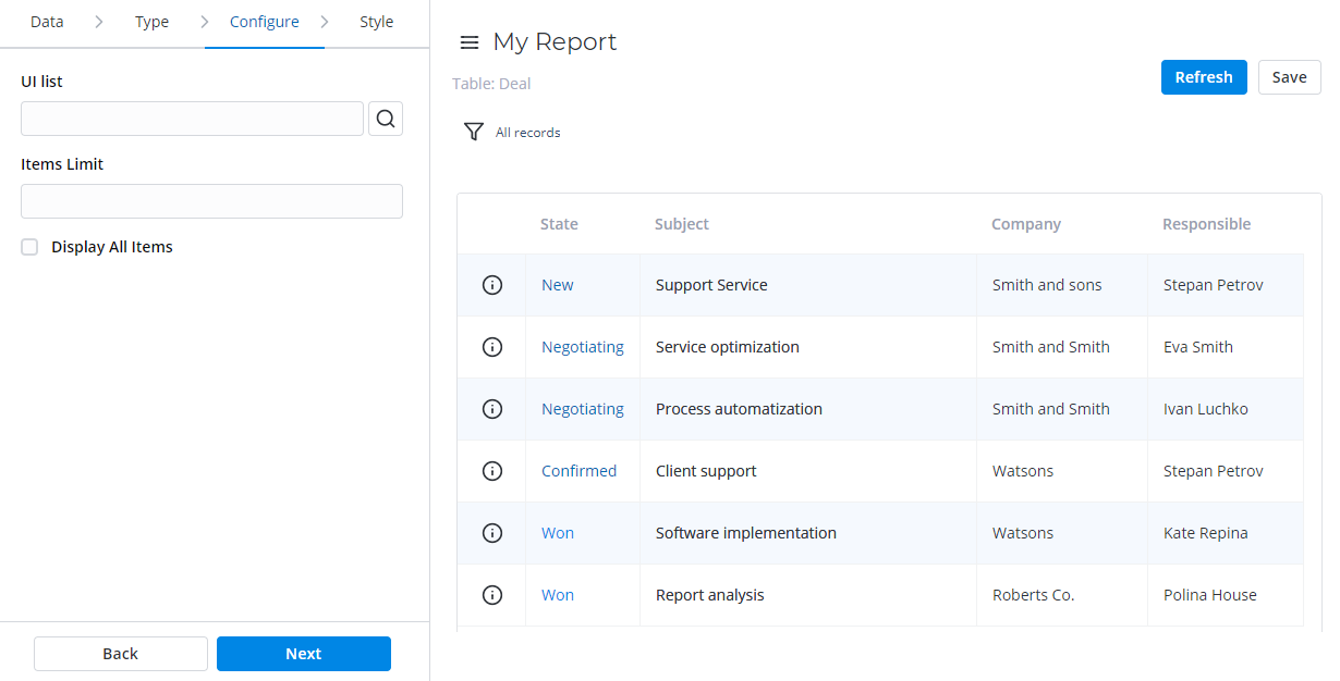
List
List reports represent table data in the form of a list view.
Configure tab
| Field | Mandatory | Description |
|---|---|---|
| List View | Y | Select a list view for a report with one of the list layouts configured. |
| Items Limit | Y | Define a limit of the table items used as a source for the report. |
| Display All Items | N | Select this checkbox to display all table items used for report configuration. When the checkbox is selected, the Items Limit field is hidden. |
Style tab
| Title | ||
|---|---|---|
| Field | Mandatory | Description |
| Report Title Show Type | N | Select the type for the report title showing. Available options:
|
| Report Title | N | Specify the title of the report. |
| Report Title Size | N | Specify the number of pixels to set the size of the report title. |
| Report Title Color | N | Select the color of the report title. Click the magnifier icon |
| Title Alignment | N | Select the alignment of the report title. Available options:
|
| Bold Title | N | Select this checkbox to make the chart title bold. |
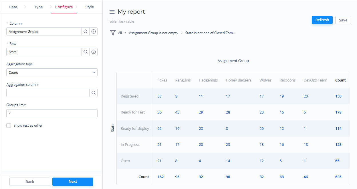
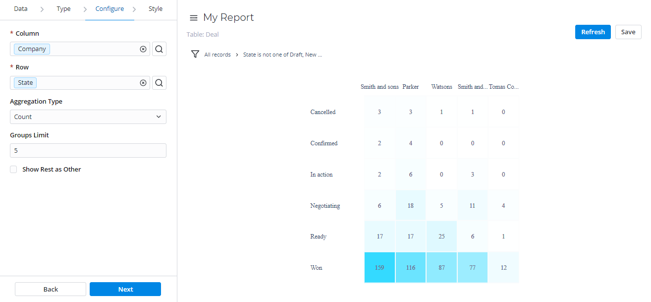
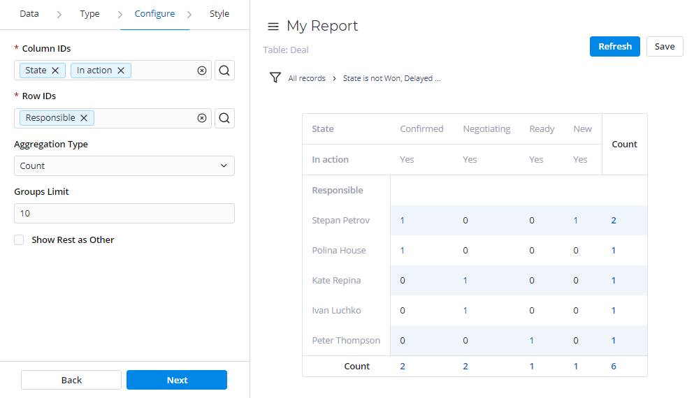
Pivot Table
Pivot reports present your data in the form of a table view. The data is analyzed, aggregated, and grouped based on two metrics (as rows and columns).
This report view is useful for comparing, summarizing, and counting a large amount of data.
Configure tab
| Field | Mandatory | Description |
|---|---|---|
| Column | Y | Set the desired table column as a column for the pivot table report. |
| Row | Y | Set the desired table column as a row for the pivot table report. |
| Aggregation Type | N | Select the data aggregation to create combined datasets for data processing. Available options:
The Sum and Average settings make sense if the aggregation column keeps the numeric data. When this aggregation option is selected, it is applied to the table column set in the Aggregation Column field. |
| Aggregation Column | N | Select a table column with numeric values for data aggregation. The Aggregation Column field is available only if the Aggregation Type option is set to one of the following: Average, Count Distinct, Sum. |
| Groups Limit | N | Define the limit of the data groups shown in your report. |
| Show Rest as Other | N | Select this checkbox to show the data groups not included in Groups Limit as one. The Show Rest as Other field is available only if the Groups Limit option is specified. |
Style tab
| General | ||
|---|---|---|
| Field | Mandatory | Description |
| Drilldown List Layout | N | Use this option to configure the view of the data slice drilled down. Click the magnifier icon See Personal list layout if you want to configure the list view. |
| Decimal Precision | N | Define how many numbers should be displayed after the point of numeric data values in your chart. This field appears when the Aggregation Type field on the Configure tab contains Sum or Average. |
| Title | ||
| Field | Mandatory | Description |
| Report Title Show Type | N | Select the type for the report title showing. Available options:
|
| Report Title | N | Specify the title of the report you create. |
| Report Title Size | N | Specify the number of pixels to set the size of the report title. |
| Report Title Color | N | Select the color of the report title. Click the magnifier icon |
| Title Alignment | N | Select the alignment of the report title. Available options:
|
| Bold Title | N | Select this checkbox to make the chart title bold. |
Heatmap
Heatmap reports display your data as the intersection of two metrics in a table with colored cells. These cells contain data values visualized with different color shades.
Configure tab
| Field | Mandatory | Description |
|---|---|---|
| Column | Y | Specify a table column as the column for the heatmap report. |
| Row | Y | Specify a table column as the row for the heatmap report. |
| Aggregation Type | N | Select the data aggregation to create combined datasets for data processing. Available options:
The Sum and Average settings make sense if the aggregation column keeps the numeric data. When this aggregation option is selected, it is applied to the table column set in the Aggregation Column field. |
| Aggregation Column | Y | Select a table column with numeric values for data aggregation. The Aggregation Column field is available only if the Aggregation Type option is set to one of the following: Average, Count Distinct, Sum. |
| Groups Limit | N | Set the limit of the data groups shown in your report with a particular number in this field. |
| Show Rest as Other | N | Select this checkbox to show the data groups not included in Groups Limit as one. The Show Rest as Other field is available only if the Groups Limit option is specified. |
Style tab
| General | ||
|---|---|---|
| Field | Mandatory | Description |
| High Score Color | N | Select the color used for high score values of the heatmap chart. Click the magnifier icon |
| Low Score Color | N | Select the color used for low score values of the heatmap chart. Click the magnifier icon |
| Drilldown List Layout | N | Use this option to configure the view of the data slice drilled down. Click the magnifier icon See Personal list layout if you want to configure the list view. |
| Decimal Precision | N | Define how many numbers should be displayed after the point of numeric data values in your chart. This field appears when the Aggregation Type field on the Configure tab contains Sum or Average. |
| Title | ||
| Field | Mandatory | Description |
| Report Title Show Type | N | Select the type for the report title showing. Available options:
|
| Report Title | N | Specify the title of the report you create. |
| Report Title Size | N | Specify the number of pixels to set the size of the report title. |
| Report Title Color | N | Select the color of the report title. Click the magnifier icon |
| Title Alignment | N | Set the alignment of the chart title selecting one of these options:
|
| Bold Title | N | Select this checkbox to make the chart title bold. |
| Legend | ||
| Field | Mandatory | Description |
| Show Legend | N | Select this checkbox to display the chart legend. |
| Legend Alignment | N | Set the alignment of the chart legend, selecting one of these options:
|
| Show Legend Border | N | Select this checkbox to make the border of your chart legend. |
Multilevel Pivot Table
Multilevel Pivot Tables reports represent your data in the form a table view. The data is aggregated, grouped, and analyzed based on two metrics (as rows and columns).
This report view is extremely useful for comparing, summarizing, and counting a large amount of data.
Configure tab
| Field | Mandatory | Description |
|---|---|---|
| Columns | Y | Define desired table columns as a data source for the Multilevel Pivot table report columns. |
| Rows | Y | Define desired table columns as a data source for the Multilevel Pivot table report rows. |
| Aggregation Type | N | Select the data aggregation to create combined datasets for data processing. Available options:
The Sum and Average settings make sense if the aggregation column keeps the numeric data. When this aggregation option is selected, it is applied to the table column set in the Aggregation Column field. |
| Aggregation Column | N | Select a table column with numeric values for data aggregation. The Aggregation Column field is available only if the Aggregation Type option is set to one of the following: Average, Count Distinct, Sum. |
| Groups Limit | N | Define the limit of the data groups shown in your report with a particular number in this field. |
| Show Rest as Other | N | Select this checkbox to show the data groups not included in Groups Limit as one. The Show Rest as Other field is available only if the Groups Limit option is specified. |
Style tab
| General | ||
|---|---|---|
| Field | Mandatory | Description |
| Drilldown list layout | N | Use this option to configure the view of the data slice drilled down. Click the magnifier icon See Personal list layout if you want to configure the list view. |
| Decimal Precision | N | Set the number defining how much numbers should be displayed after the point of numeric data values in your chart. This field appears when the Aggregation Type field on the Configure tab contains Sum or Average. |
| Title | ||
| Field | Mandatory | Description |
| Report Title Show Type | N | Set the type for the report title showing. Available options:
|
| Report Title | N | Specify the title of the report you create. |
| Report Title Size | N | Specify the number of pixels to set the size of the report title. |
| Report Title Color | N | Select the color of the report title. Click the magnifier icon |
| Title Alignment | N | Select the alignment of the report title. Available options:
|
| Bold Title | N | Select this checkbox to make the chart title bold. |