When creating a widget, define its form, fields, and their behavior by using the template elements to specify the widget view and the way it displays with HTML and and Widget Attributes. The widget template also allows end-users to input data and interact with it. Apply HTML tags to add and control elements such as buttons and various types of fields.
<activityFeed>
This tag is intended to provide the Activity Feed functionality on forms, either for portal or agent views.
The following attributes are applicable:
| Attribute | Type | Default value | Required | Description |
|---|---|---|---|---|
| sysId | String | "" | N | This attribute is intended to specify the record ID on which the activity feed widget is enabled. |
| tableName | String | "" | N | This attribute specifies the table system name (for example, "task") on which the Activity Feed widget is enabled. |
The attribute values can also be obtained via URL in two ways:
- When on the specified record page, the attribute values they will be populated automatically.
- When the specified URL provided, the attribute values will be populated out of GET-parameters.
Example for case 2
- A provided URL looks like this (example): https://instance.example.com/?table_name=user&record_id=161416916116380709.
- The table_name and record_id parameter values are obtained from this URL.
- The table_name parameter value is mapped to the tableName attribute.
- The record_id parameter value is mapped to the sysId attribute.
| Code Block | ||||||
|---|---|---|---|---|---|---|
| ||||||
<activityFeed tableName="user" sysId="161416916116380709"></activityFeed> |
<authfull>
This tag contains full functionality of the user authorization including registration form. It also supports configurable validation in strings containing user login and password.
The following attributes are applicable:
he following attributes are applicable:
| Attribute | Type | Default value | Required | Description |
|---|---|---|---|---|
| class | String | "" | N | Specify a CSS class name defined in the CSS field. |
| isRegistration | Boolean | "false" | N | This attribute is responsible for enabling new users registration. If it is set to |
"true", then new portal users can sign up; otherwise, this is prohibited, and only existing users can sign in. Possible attribute values: |
"true" |
or |
"false". | ||||
| isSwitchLang | Boolean | "true" | N | This attribute is responsible for enabling user locale |
|---|
switching on the authorization page. If this attribute is equal to |
"false", then the user will not be able to change the interface language, and will use the default system language. Possible attribute values: "true" or "false". | ||||
| isRememberMe | Boolean | "false" | N | This attribute is responsible for specifying whether |
|---|
user credentials should be saved on this computer or not. To save the credentials, make this attribute equal to |
"true". Possible attribute values: "true" or "false". | ||||
| logo | String | "" | N | Absolute path to the logo displayed on the authorization page. For example: https://example.com/logo.png |
|---|---|---|---|---|
| isResetPassword | Boolean | "false" | N | This attribute is responsible for enabling user password |
retrieving. If it is set to "true", then the widget form will contain the retrieval link. Possible attribute values: |
"true" |
or |
"false". | ||||
| redirectTo | String | "" | N | Specify the path to the portal |
|---|
| page to redirect a user after successful authorization. | ||||
| useSourceUrl | Boolean | "false" | N | This attribute |
|---|
Please note that if this attribute value is "true", then it is higher priority than the redirectTo attribute value.
Prerequisites: in both cases, user is not logged in the Service Portal.
- The useSourceUrl attribute value = "false".
- An user follows the link looking alike https://instance.example.com/portal/view_task?table_name=itsm_task&record_id=162193232428931210&view=ServicePortal
- User is redirected to the authorization form, where he need to provide his credentials.
- After authorization, user is redirected to the Service Portal main page.
- The useSourceUrl attribute value = "true".
- An user follows the link looking alike https://instance.example.com/portal/view_task?table_name=itsm_task&record_id=162193232428931210&view=ServicePortal
- User is redirected to the authorization form, where he need to provide his credentials.
- After authorization, user is redirected to the page available by the initial link.
| Code Block | ||||||
|---|---|---|---|---|---|---|
| ||||||
<authfull redirectTo="/portal" isRegistration="true" isSwitchLang="true" isRememberMe="false" isResetPassword="true"></authfull> |
<authheader>
This component allows displaying a user's name and avatar, or prompts them to log in if they haven't already. The following attributes are applicable:
is responsible for the post-authorization redirection to portal links visited from external sources (for example, email notifications). Reassign its value to "true", so after opening a page and authorization, the requested page will open. Otherwise, a page specified with the redirectTo attribute opens. Possible attribute values: "true" or "false". |
| Code Block | ||||||
|---|---|---|---|---|---|---|
| ||||||
<authfull redirectTo="/portal" isRegistration="true" isSwitchLang="true" isRememberMe="false" useSourceUrl="true" isResetPassword="true"></authfull> |
<authheader>
This component allows displaying a user's name and avatar, or prompts them to log in if they haven't already. The following attributes are applicable:
| Attribute | Type | Default value | Required | Description | ||
|---|---|---|---|---|---|---|
| class | String | ""' | ||||
| Attribute | Type | Default value | Required | Description | ||
| class | String | ""' | N | Specify a CSS class name defined in the CSS field. | ||
| profileUrl | String | '"" | N | Specify the path to the portal section containing the personal pages when the model item is clicked.
|

| Code Block | ||||||
|---|---|---|---|---|---|---|
| ||||||
<authheader profileURL="/portal/cabinet"> |
<breadcrumbs>
A breadcrumbs portal tag allows to display a navigation chain consisting of page nodes, portal categories and a an terminating item (a page, for example).
This widget uses the object received from the back-end server to build the breadcrumbs chain with the format below:
{sys_id, title, url}

<card>
You can use this tag part of the different system functionality, for example, Portals, or Taskboards.
The following attributes are applicable:
| Attribute | Type | Default value | Required | Description |
|---|---|---|---|---|
| class | String | "" | N | Specify a CSS class name defined in the CSS field. |
| url | String | "/" | N | An URL defining the page for this card. |
| img | String | ellipse.svg (icon) | N | In this field, specify the code of SVG image file (previously decoded)., |
| name | String | "" | Y | The card title. |
| shortDescription | String | "" | N | The card short description. |
| Code Block | ||||||||
|---|---|---|---|---|---|---|---|---|
| ||||||||
<div class="main-body__cards__column__items">
<card url="second_portal/catalog" name={data.catalogTitle} shortDescription={data.catalogDescription} img='<svg version="1.0" xmlns="http://www.w3.org/2000/svg" width="240" height="240" viewBox="0 0 180 180"><path d="M84 .7C43.9 3.4 10.8 32.2 2.5 71.6c-1.7 8.1-1.9 26.5-.4 35 6 33.7 31.9 61.6 65.7 70.6 11.2 2.9 33.5 2.9 44.7-.1 30.4-8.1 54.6-31.7 63.4-61.8 4.8-16.6 5.1-30 1-46.3-6.2-24.8-21.7-45.2-43.9-57.8C120 3.9 100.2-.4 84 .7zm21.6 11.4c24.3 4.5 45.7 21.4 56.8 45 5.4 11.4 6.9 18.6 7 32.9 0 15.3-1.5 21.6-8.6 36-4.5 9.3-6.3 11.6-14.7 20-7.8 7.8-11.3 10.5-18.7 14.3-13.5 6.9-22.3 9-37.4 9-10 0-14.1-.4-20.5-2.3-28.1-8-49.2-29.3-56.7-57.2-2.9-10.9-3.1-27.1-.4-37.8 7.4-29.7 31.1-53.2 60-59.5 7.5-1.7 25.2-1.9 33.2-.4z"/><path d="M45 57c-4.3 4.3-1.4 11 4.8 11 5.6 0 8.2-7 4.2-11-1.1-1.1-3.1-2-4.5-2s-3.4.9-4.5 2zM69 58.9c-1.6 3.1-1.2 4.9 1.4 6.6 2.1 1.4 6.6 1.5 33.5 1.3 33.4-.3 33-.3 33.1-5.3 0-4.4-.8-4.5-34.7-4.5-30.8 0-32.3.1-33.3 1.9zM48 83.8c-5 1.6-6.6 7.6-3 11.2 5.7 5.7 14.2-2 9.5-8.7-1.6-2.2-4.1-3.2-6.5-2.5zM69.6 86.6c-1.9 1.8-2 3.8-.6 6.5 1 1.8 2.3 1.9 23 1.9 18.5 0 22.1-.2 23.4-1.6 2.1-2.1 2-4.7-.2-6.7-2.7-2.5-43.2-2.5-45.6-.1zM45 114c-4.3 4.3-1.4 11 4.8 11 5.6 0 8.2-7 4.2-11-1.1-1.1-3.1-2-4.5-2s-3.4.9-4.5 2zM69 115.9c-1.5 2.8-1.2 4.6.8 6.4 1.6 1.5 5.4 1.7 32.9 1.7 28.8 0 31.1-.1 32.6-1.8 2-2.2 2.2-5.3.5-7-.9-.9-9.7-1.2-33.5-1.2-30.8 0-32.3.1-33.3 1.9z"/></svg>'></card>
</div> |
<category>
This portal tag is a component allowing displaying portal categories and items structure. It interacts with some other widgets, like <breadcrumbs> or <sidemenu> widgets.
The following attributes are applicable:
| Attribute | Type | Default value | Required | Description |
|---|---|---|---|---|
| class | String | "" | N | Specify a CSS class name defined in the CSS field. |
| nodeId | Big Integer | "" | N | Portal node ID. |
| categorySubject | String | "" | Y | Specify a table field containing category titles. |
| categoryDescription | String | "" | Y | Specify a table field containing category descriptions. |
| itemSubject | String | "" | Y | Specify a table field containing item titles. |
| itemDescription | String | "" | Y | Specify a table field containing item descriptions. |
| categoryIcon | String | "" | N | Specify a table column containing category icons. |
| itemIcon | String | "" | N | Specify a table column containing item icons. |
| Code Block | ||||||
|---|---|---|---|---|---|---|
| ||||||
<Category nodeId="158766114011088368" categorySubject="name" categoryDescription="short_description" itemDescription="vendor" itemSubject="city" itemIcon="icons"></Category> |
<categoryFlat>
This portal tag is intended to display various portal object categories, for example, Knowledge Base categories. It involves two elements types: subcategories and category elements; subcategory goes first in element hierarchy, and elements do go second.
The following attributes are applicable:
| Attribute | Type | Default value | Required | Description |
|---|---|---|---|---|
| class | String | "" | N | Specify a CSS class name defined in the CSS field. |
| nodeId | Big Integer | "" | N | Portal node name. |
| categorySubject | String | "" | Y | Specify a table field containing category titles. |
| categoryDescription | String | "" | Y | Specify a table field containing category descriptions. |
| itemSubject | String | "" | Y | Specify a table field containing item titles. |
| itemDescription | String | "" | Y | Specify a table field containing item descriptions. |
| categoryIcon | String | "" | N | Specify a table column containing category icons. |
| itemIcon | String | "" | N | Specify a table column containing item icons. |
| user | String | "" | N | Specify a column from which the information about item originator should be taken (for better clarity, see the example below). |
| date | String | "" | N | Specify a column from which the item creation date and time should be taken (for better clarity, see the example below). |
| preview | String | "" | N | Specify a column containing information can be used for the card preview. |
| Code Block | ||||||
|---|---|---|---|---|---|---|
| ||||||
<CategoryFlat nodeId="158934872713077631" categorySubject="name" categoryDescription="description" itemDescription="body" itemSubject="name" date="sys_created_at" user="sys_created_by"></CategoryFlat> |
<dropdownMenu>
Creates a dropdown menu with menu elements with any nesting level.
The following attributes are applicable:
| Attribute | Type | Default value | Required | Description | |
|---|---|---|---|---|---|
| class | String | "" | N | Specify a CSS class name defined in the CSS field. | |
| size | String | "" | Y | The dropdown menu size. You can specify it by choosing from predefined options:
| |
| events | String | "" | Y | Specify actions to perform after one of the predefined patterns is selected:
| |
| isShow | Boolean | false | N | This attribute is responsible for menu displaying. Possible attribute values: "true" or "false". | |
| doClose | doClose | Function | "" | N | This is a method defining an additional action when the menu closes. |
| model | String | "{}" | Y | A reference to the dynamic variable storing a menu items and actions. |
| Code Block | ||||||||
|---|---|---|---|---|---|---|---|---|
| ||||||||
<dropdownMenu model="data.menu"></dropdownMenu> |
| Code Block | ||||||||
|---|---|---|---|---|---|---|---|---|
| ||||||||
; (() => {
    data.menu = {
        "menu": {
    "size": "low",
    "event_to_display": [
        "click"
    ],
    "sections": [
        {
            "order": "1",
            "elements": [
                {
                    "title": "Text",
                    "order": "1",
                    "event_to_display": ["click"],
                    "events": {
                        "click": "runScript()"
                    },
                    "child_elements": [
                        {
                            "title": "Text22",
                            "event_to_display": ["click"],
                            "events": {
                                "click": "runScript()"
                            },
                            "child_elements": [
                            {
                            "title": "Text2",
                            "event_to_display": ["click"],
                            "events": {
                                "click": "runScript()"
                            },
                            "child_elements": []
                        }
                            ]
                        }
                    ]
                },
                {
                    "title": "Title",
                    "order": "2",
                    "event_to_display": ["click"],
                    "events": {
                        "click": "runScript()"
                    },
                    "child_elements": [
                        {
                            "title": "Text2",
                            "event_to_display": ["click"],
                            "events": {
                                "click": "runScript()"
                            },
                            "child_elements": []
                        }
                    ]
                }
            ]
        },
        {
            "order": "2",
            "elements": [
                {
                    "title": "Text",
                    "order": "1",
                    "event_to_display": ["click"],
                    "events": {
                        "click": "runScript()"
                    },
                    "child_elements": []
                }
            ]
        }
    ]
}
    }
})(); |
<form>
A form widget is a widget displaying a record form when necessary parameters, such as a table, form view, record ID, are specified. It helps to ensure user interaction with the record form, in the aspect of the field changes and form reaction. It also supports the functionality of widgets added to the form.
Structure
This widget generally is structured as shown below:
- Embedded widget containing the form elements.
- Form header block:
- The header can be taken from the column with the Display by Ref attribute turned on.
- Form sections block:
- The Default section should be the first in the section list if there is more than one.
- Every widget section is relevant to the appropriate form section and has its own title.
- This block is mandatory.
- Form footer block containing UI actions (buttons and others).
Elements
Form widget elements, like form elements, can be of different types. All field types functionality used in forms is supported there (such as properties, behavior, scalar type, and so on).
- If the widget element displays the date and time, then it is displayed in the user timezone.
- Widget elements containing fields that are to be multilanguage and use the Translated Text field type (such as table and column titles, choice options) display values in the current user locale.
Attributes
The dynamic form creating components. The following attributes are applicable:
Attribute
Type
Default value
Required
Description
This attribute stores the form name.
Define the form name within the template in the Template field:
| Code Block | ||||
|---|---|---|---|---|
| ||||
<Form name = "custom"></Form> |
And after that, you'll can call it in the widget client script:
| Code Block | ||||||
|---|---|---|---|---|---|---|
| ||||||
const form = s_widgets.getForm('custom'); |
Specifying this attribute will add a Save button on the form with the customized text (see the code example below).
It makes sense to use this attribute when UI actions using are prohibited due to any reasons (the ui-actions attribute is equal to "false").
}
    }
})(); |
<form>
This tag is responsible for displaying a record form. For more information, please refer to the Form Widget Tag article.
Do not specify the sys_id parameter for a newly created form that did not exist before.
Form example
| Code Block | ||||||
|---|---|---|---|---|---|---|
| ||||||
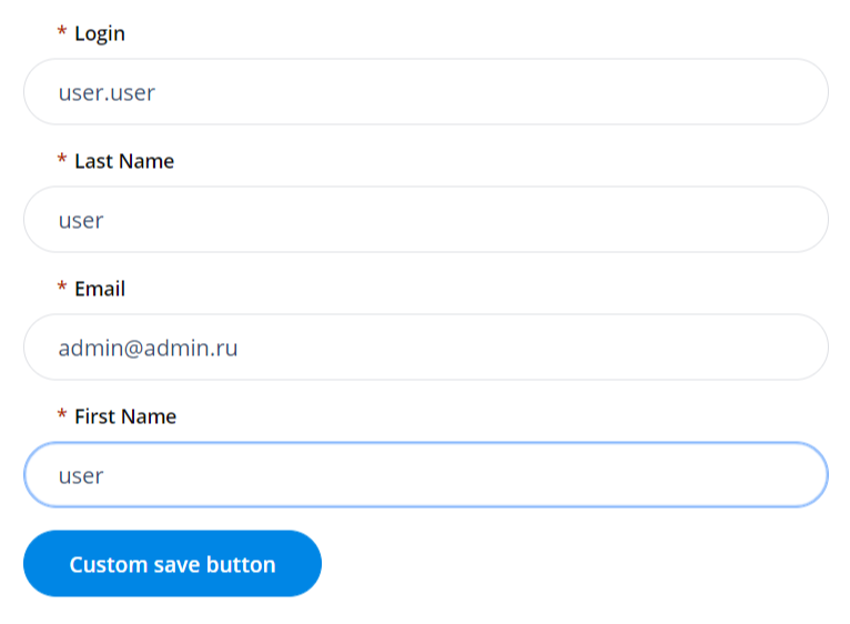
<Form tableName="user" sysid="158747771611397284" view="Profile" save="Custom save button" uiActions="true" userScripts="true"></Form> |
<listitems>
The list of records portal tag allows displaying table items as a list view.
The following attributes are applicable:
| Attribute | Type | Default value | Required | Description |
|---|---|---|---|---|
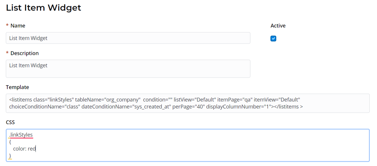
| class | String | "" | N | Specify a CSS class name defined in the CSS field. See the screenshot below the table to learn more. |
| tableName | String | "" | Y | Specify a table containing output elements to display. This attribute is mandatory. |
| listView | String | "" | Y | Specify a list view to use (this view need to be created first in the UI list (sys_ui_list) dictionary). |
| itemPage | String | "" | Y | Specify the path to a page in the portal structure. Example: If you set itemPage="page" as shown in code example below, then your URL may look like this: https://your_instance_url/your_portal/page |
| itemView | String | "" | Y | Specify the view used for item rendering. |
| condition | String | "" | N | Specify a condition applied to the list. This attribute should contain data of the Conditions type. |
| choiceConditionName | String | "" | N | This attribute is to specify columns containing data of the Choice type if you need to specify choice options in your condition. |
| dateConditionName | String | "" | N | This attribute is to specify columns containing data of the Date or Date/Time type if you need to specify date ranges in your condition. |
| perPage | Integer | "20" | N | Specify the number of page items. |
| displayColumnNumber | Integer | "" | Y | Specify a column number to open a record by clicking on it. |
| Code Block | ||||||||
|---|---|---|---|---|---|---|---|---|
| ||||||||
<listitems class="linkStyles" tableName="itsm_incident" condition="" listView="Widget" itemPage="page" itemView="view" choiceConditionName="sys_created_at" dateConditionName="sys_created_at" perPage="25" displayColumnNumber="2"></listitems> |
<previewList>
This list view portal tag allows displaying table items as a customizable list.
The following attributes are applicable:
| Attribute | Type | Default value | Required | Description |
|---|---|---|---|---|
| class | String | "" | N | Specify a CSS class name defined in the CSS field. |
| condition | String | "" | N | Specify a condition applied to the list. This attribute should contain data of the Conditions type. |
| tableName | String | "" | Y | Specify a table containing items to display on the list view. |
| view | String | "" | N | Specify a list view name used. |
| elementCount | String | "20" | N | Specify the number of page items. If not specified, then equal to '5' by default. |
| subjectColumn | String | "subject" | N | Specify a table column containing list item subjects. |
| dateColumn | String | "sys_created_at" | N | Specify a table column containing dates related to list items. |
| stateColumn | String | "state" | N | Specify a table column containing list item states. |
| transparent | Boolean | "false" | N | Set this attribute to "true" to set up the full view. Possible attribute values: "true" or "false". |
| wrap | Boolean | "false" | N | Set this attribute to "true" to set up the quick view. Possible attribute values: "true" or "false". |
| itemView | String | "Default" | N | Specify the view used for item rendering. |
| ListHeader | String | "" | N | This attribute allows to provide the list header. |
| Code Block | ||||||
|---|---|---|---|---|---|---|
| ||||||
<previewList tableName="announcement" view="AnnounceView" elementCount="3" subjectColumn="subject" dateColumn="sys_created_at" stateColumn="state" wrap="true" itemView="announceView"><ListHeader><div>Announcements</div></ListHeader></previewList> |
<results>
A portal tag responsible for displaying the Search results.
The following attributes are applicable:
| Attribute | Type | Default value | Required | Description |
|---|---|---|---|---|
| class | String | "" | N | Specify a CSS class name defined in the CSS field. |
| isTreeShown | Boolean | "false" | This attribute is responsible for search results grouping and displaying the results grouping tree. See the screenshot below as an example.
| |
| itemPage | String | "" | Y | Specify a path to a page in the |

portal structure. This attribute is responsible for customizing search results page URL. Example: If you set the pageItem |
attribute value to |
"page", as shown in code example below, then your search results URL will look alike | ||||
| itemView | String | "Default" | N | Specify a |
|---|
| view name |
| for a specified search result when opened. If not specified, then the record is opened with the |
| Default |
| view. | ||||
| quantity | String | "" | N | Specify the maximum search results amount per page. |
|---|---|---|---|---|
| searchQuery | String | "" | N | Search bar input string to perform search request and display results. |
| tsGroupId | Big Integer | "" | N | Enter an ID of the table group to specify the search area. |
Example:
| Code Block | ||||||
|---|---|---|---|---|---|---|
| ||||||
<results searchQuery="{data.search}" tsGroupId="157018693719021198" quantity="4" itemPage="page" itemView="Default" isTreeShown="true"> |
<search>
A portal tag responsible for search functionality implementing.
| Attribute | Type | Default value | Required | Description |
|---|---|---|---|---|
| class | String | "" | N | Specify a CSS class name defined in the CSS field. |
| itemPage | String | "" | Y | Specify a path to a page in the |
Example: If you set itemPage="page" |
as shown in code example below, then your search URL may look like this: | ||||
| itemView | String | "Default" | N | Specify a view name responsible for the search page |
|---|
| looking. | ||||
| onChange | Function | "" | N | Specify a function called when clicking the |
|---|
| Search |
| button. | ||||
| placeholder | String | "" | N | A text inside the search field. |
|---|---|---|---|---|
| searchUrl | String | "" | N | A URL suffix defining a page to redirect to after clicking the |
| Search |
| button. | ||||
| searchQuery | String | "" | N | Search bar initial value. |
|---|---|---|---|---|
| showTitle | Boolean | "false" | N | A boolean-type attribute with possible |
"true" |
or "false" values. It is responsible for title displaying. Possible attribute values: "true" or "false". | ||||
| size | String | "" | N | Specifies the search bar size. Available values: |
|---|
| "lg |
| " (large) |
| or "sm |
| " (small). | ||||
| title | String | "" | N | Define a custom title instead of a default one. To use a custom title, please set a |
|---|
showTitle |
attribute value equal to |
"true" |
first. | |||
| top | Integer | "4" | N |
|---|
| How many matches should be shown in |
| search suggestion. | ||||
| tsGroupId | Big Integer | "" | N | Enter an ID of the table group to specify the search area. You can find the necessary information in the Text Search Group (ts_group) |
|---|
| table. |
| Code Block | ||||||||
|---|---|---|---|---|---|---|---|---|
| ||||||||
<search tsGroupId="157018693719021198" top="3" size="lg" itemPage="page" itemView="Service Portal RO" showTitle="1" onChange="s_widget_custom.search(arguments[0]);"> |
<sidemenu>
This tag allows adding a side-menuto add a sidemenu.
The following attributes are applicable:
| Attribute | Type | Default value | Required | Description |
|---|---|---|---|---|
| parentsDepth | Integer | 0 | Y | Specify the depth of the parent category. |
| childrenDepth | Integer | 0 | Y | Specify the depth of the child categories. |
| includeCategories | Boolean | "false" | N | This attribute is responsible for including categories into the sidemenu. Possible attribute values: "true" or "false". |
| includeItems | Boolean | "false" | N | This attribute is responsible for including items into the sidemenu. Possible attribute values: "true" or "false". |
| Code Block | ||||||||
|---|---|---|---|---|---|---|---|---|
| ||||||||
<SideMenu parentsDepth="1" childrenDepth="1" includeCategories="1" includeItems="1">\ </SideMenu> |
| Table of Contents | ||
|---|---|---|
|